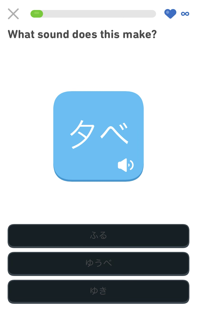
My partner is learning Japanese using the Duolingo app. They’ve been dutifully opening the app and doing daily challenges for over 400 days now. A few days ago, they shared this screenshot with me:

If I could wager a guess, it looks like there was a bug with dark mode color logic on their multiple choice button component. I totally get it. Managing color across a mature application like Duolingo is a complicated thing, and that’s even before you consider dark mode.
That being said, it’s a pretty nasty color contrast issue, one that can keep a lot of people from being able to use the app until the bug is fixed with an update.
Native apps versus the web
If you can’t see the button’s content, you can’t use the app. And since it’s an app, you need to wait until:
- The bug is recognized,
- Triaged,
- Fixed,
- An update is pushed out, and then
- Downloaded and applied.
Let’s hope the bug is important enough that it’s not banished to the icebox forever.
On the web, we have options. We can use things like a browser’s inspect tool, extensions, and specialized display modes to modify the content and turn it into something usable.
Have you ever popped open the console and removed a pasting passwords restriction on an input field? That’s a great example of the resiliency and flexibility of the web platform, and these qualities make it radically different from how most other software is built.
People are resourceful
Digital literacy is a spectrum, but it’s also bad thinking to assume a non-technical person won’t make highly technical modifications to something to get what they need, provided the motivational factor is high enough.
Let’s also not forget support networks. Has a coworker shared a little tip with you on how to navigate some arcane internal application at your company? Or have you ever helped a family member or friend with some technical issue they were experiencing?
Names
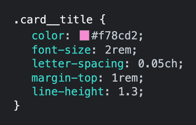
For the most part, CSS’ properties and values are easy for a layperson to understand. background-color communicates its purpose in a straightforward manner, and a value of #f78cd2 isn’t too hard to figure out, especially when browsers show you a little sample alongside the declaration.

Similarly, someone may not know what a rem is, but it is pretty easy to piece together that changing a value of 1rem to 2rem on a declaration of margin-top will increase the space on top of something.
Taking this a step further, someone may not know what BEM methodology is, but can probably understand that a class named .c-product__description is the description of a product the same way a class named .c-heading--secondary is a variation of a heading. Similarly, the intent behind a utility class called color-text-blue is pretty easy to discern.
Human-friendly CSS class names
A person inspecting human-friendly class names can then modify them with a good deal of confidence about what exactly they’re tweaking.
For example, someone could inspect a card component to find the class controlling its title, then modify the title class declarations to suit their needs:
.c-card__title { … }A little more work like this and we can do stuff like construct our own themes. We don’t need to petition the services we’re theming to add our work, either—we can just apply our changes and carry on.
Robot-friendly CSS classes
Minified CSS class names, like what you’d get on Twitter or Instagram, can be the result of approaches like ultra efficient optimization strategies or React Native transpilation.
Here, the qualities of the previous .c-card__title class may be broken up into more atomic classes by automation that recognizes declaration commonalities shared across multiple unrelated components.
.jxks-901oao { … }
.jxks-16my406 { … }
.rxq3-poiln3 { … }
.rxq3-bcqeeo { … }
.rxq3-qvutc0 { … }
While I can modify the broken apart, non-human friendly class names, I am unsure of what else they’ll modify. Effectively what we’ve done is take the “two CSS properties walk into a bar” joke and kicked it down the road a bit.
Interfaces
To quote Nick Arner, “Interfaces are our gateway to working with computers.”
There are good interfaces, as well as bad ones. Interfaces aren’t always visual, either. It can be something like API design, or—you guessed it—how your CSS is presented to the person visiting your website or web app.
Human-friendly CSS is an interface that prioritizes people. It allows someone using your website or web app to easily make modifications to get what they need. This is huge because we can’t know who the person is, or what circumstances they’re experiencing.
Robot-friendly CSS is an interface that prioritizes machines—class names are downstream effects. In the case of React Native, it is prioritizing a framework that can export to multiple platforms. In the case of performance, it is hyper-optimization for a production release. Both create an end result obfuscates CSS class names.
Spending your budget
Performance budgets allow us to strategically prioritize what we load and why. Working with a performance budget means you practice discretionary spending, prioritizing what you think is most important for the people who will use your website or web app.
For an experience that displays art, it makes sense to prioritize how images are loaded. A collaborative canvas-style whiteboarding service will probably want to emphasize capacity instead.
For a CSS class naming strategy, we need to weigh the value of providing a resource that can be relatively easily manipulated by the end user versus a saved few kilobytes. We also need to consider those few saved kilobytes of CSS against 12 MB of decompressed JavaScript.
Against the grain
Web apps like to pretend they’re native apps, and a native app mindset comes along for the ride. The same way class names get obfuscated is the same way zooming and scaling is blocked is the same way copying and pasting gets restricted.
The problem is this isn’t materially honest. The web is malleable, and that is a highly intentional design decision. Honoring it makes things better for everyone.
Power
Obfuscation is the tricky bit. Most of the time it is unintentional, but it can very much be a premeditated act.
Anecdotally, I have a smart, talented friend who works for a large, popular technology company. They were charged with auditing and remediating an obfuscated web app without the benefit of React Developer Tools—a frustrating and painstaking act. It was only later pointed out that this extension existed and could be used (this is also a failure of process, and more evidence that you can’t solve social problems with technology alone).
The more we move these kinds of concerns into the abstract, the more obscure and inaccessible they become. A person who could make small style tweaks to improve their quality of life is now two steps removed from being able to do so.
The trickle-down and side effects our choices create can have real-world consequences, and that’s something I think needs to be considered more when evaluating technology choices.
You’re not Twitter
I know of another large, popular technology company (not Twitter) that serves obfuscated CSS classes because the website is compiled using React Native.
The tragicomic bit is that the companies’ iOS and Android apps are built using native code. Both mobile development teams migrated away from React Native, and the website remains an awkward vestigial artifact of this failed approach.
This is to say that if a multibillion dollar company with near-unlimited resources can’t support an approach like this, you may want to think twice before imitating perceived success—most websites and web apps’ needs aren’t that complex.
Don’t you think you’re making a mountain out of a molehill?
Stylus on the Chrome Web Store has more than half a million users. Stylish has over three million. That’s a lot of people modifying the web to get what they want.
We can also do a little bit better than an appeal to popularity. I’d like you to consider the ability for an individual to improve their quality of life. Some web experiences you’re forced to use. Think jobs, medical portals, government services, etc.
If the bright red branding of the web app someone is forced to use for their job 8‒10 hours every day gives them tension headaches, shouldn’t they be able to dial it down to something more soothing? Or what about someone with ADHD who wants to block auto playing video to be able to read the news? Or someone with a vestibular disorder who wants to scroll without throwing up?
Being able to fix something you’re forced to endure creates an immediate and appreciable improvement on your quality of life. And that’s important.
Further reading
- Browsing tips BryceWray.com