I work on design systems now. It scratches a lot of itches I have, most importantly organizing and standardizing things, as well as baking accessibility in at both the design and development layers.
My very cool boss is working on updating our grid system, and with that comes conversations about vertical rythm.
If you’re not familiar, vertical rhythm is a way to consistently add vertical spacing between things by providing predefined measurement values. Typically these measurement values are derived from an underlying source of logic such as a modular scale.
The idea for providing measured stops for vertical spaces is a method for both designers and developers to work from a common source of truth. It enforces consistency across different parts of a website, as well as other websites that also utilize the design system.
Consistency is an important thing in any design system. There are also a couple other big-picture considerations our design system needs to accommodate, which in turn affects our approach:
- We’re contractually obligated to use Sketch, which lacks a lot of niceties I’ve come to expect from Figma in terms of codification, documentation, and developer handoff.
- We have a “known unknown” problem, where there are designers and developers from an unknown amount of external teams consuming our content. These are teams that we aren’t necessarily communicating with, or who aren’t necessarily aware of, or reading our documentation.
In terms of a mechanism for communicating vertical spacing in Sketch, there are a few approaches we were thinking through:
Manually moving things around until they “look right”
This is pure chaos and cannot scale.
Bake a single vertical space into each component
The idea here is we collectively decide that each component only uses one measurement to define how far away it should be placed.

I’m of the school of thought that spacing should always go on the top, so it’d be adding negative space to the top of each component symbol.
The problem with this approach is it is too limiting to be usable in the real world. One set measurement won’t meet the myraid use cases of an unknown number of unknown designers working on an unknown number of projects with unknown content needs.
If it is too limiting, it will be ignored. This means vertical spacing gets moved back into manually moving things around until they “look right” territory.
Make vertical spacing a component prop
The idea here is the space on top of each component is a toggleable set of distances, and these distances are a set of codified values. A designer can can then toggle the prop to use a spacing value that works best for their needs.

This is my preferred approach! Threading spacing abstraction into a component in a systemized way like this tightly couples vertical spacing with each component instance.
If we were using Figma, this would be the end of the post. Its Variants functionality can handle exactly this sort of thing with elegance and grace. Unfortunately, we’re not using Figma.
To accomplish this sort of thing in Sketch, we’d have to create a symbol for each component with each spacing value, and then each variant of the component. In all fairness, you need to also do this in Figma to get Variants set up.
The real issue, however, is how it is exposed to the designer using the design system component.
Sketch exposes variants as submenus, so it takes a lot of digging to get what you need. This is friction, which means it decreases the likelihood a designer will use both the component and the design system.

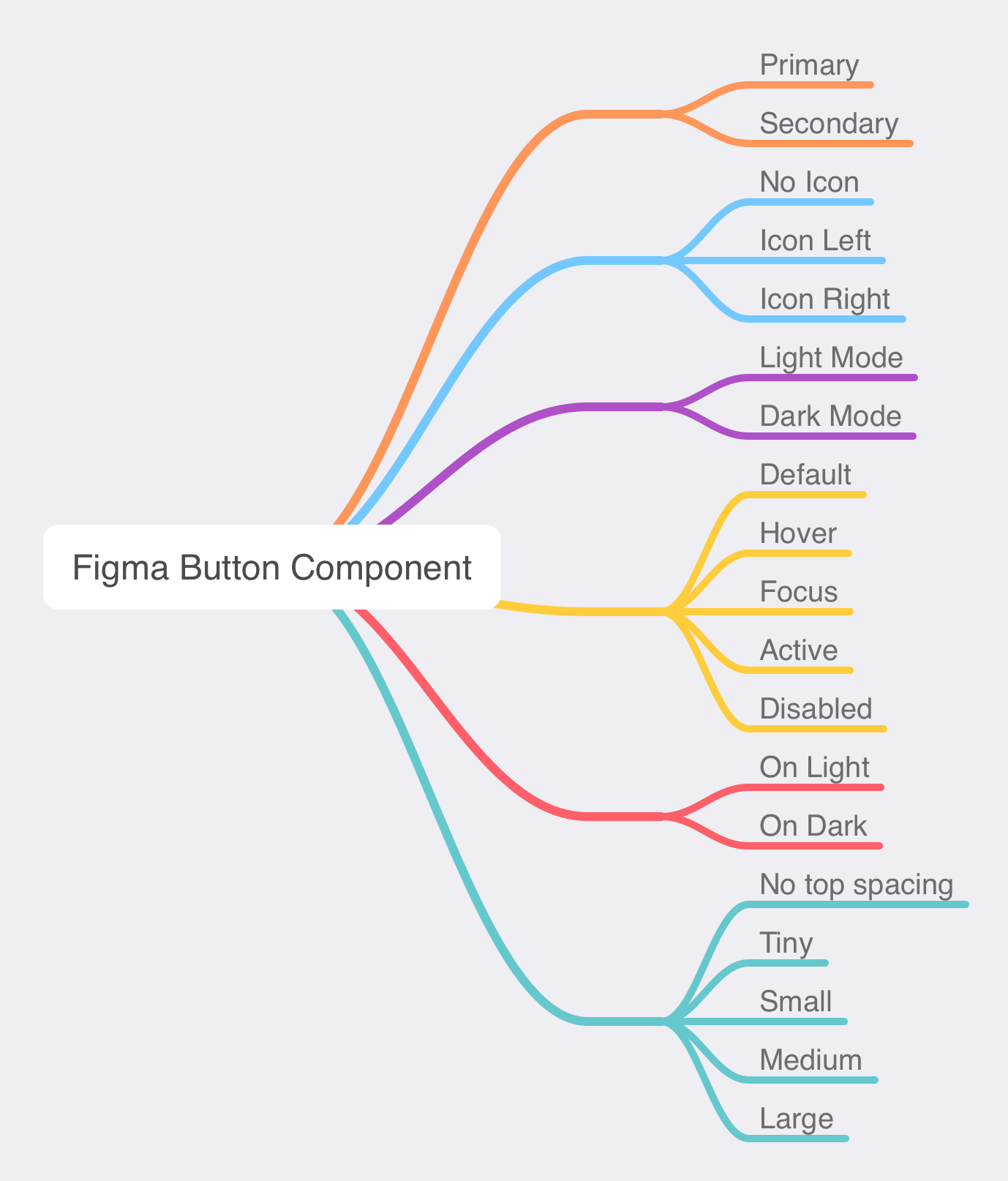
Compare this to Figma, which exposes this information in a far more ergonomic way:

Surface area
While creating mature components in Sketch and Figma both take a lot of upfront work, the way a designer interacts with the component differs based on design choices the app developers made about how components are constructed. This in turn affects a designer's experience in working with the design system as it manifests in a design tool.
Here's how Sketch’s hierarchal component nesting approach compares to Figma’s more categorical toggle approach:
Sketch

Figma
Spacer components
Since component props are off the table, the only real sensible thing to do is create a documentation “meta” component that captures these spacing values.

Designers can then take these spacing components and use them to “Lego” components on a design together. This approach:
- Codifies a set of predefined spacing values.
- Names and presents it in a way that is easy to discover, easy to understand, and easy to access.
- Provides a consistent way for developers to discover when inspecting designer work, which reinforces the use of the code-facing spacing abstraction.
Spacer divs
Spacer divs is a development technique that was in vogue a few months ago. As an old-school web nerd, it feels awkward and gross—like table-based layout 2.0.
Going with the spacer component approach feels like we’re suggesting using spacer divs to match. I’d much prefer the components to have a vertical spacing prop on the code end of things that maps to an abstracted margin or padding value (A CSS Custom Property fed by a design token, if you’re doing it right).
Talk to people
Design systems are for interfaces, but interfaces are worked on by people. To disincentivise using spacer divs and use component props instead, you’ll want to have conversations with your design system’s developers. I prefer frequent communication and collaboration to do this.
Until design tools mature more and intent can be more easily carried through, we need to consider:
- The surface area we as design system maintainers create, how that affects the ergonomics of designer and developer workflows,
- How the structuring of the design system itself will incentivise using it properly,
- Where design system maintainers need accommodate tooling limitations and do the hard part to make it easy for others.