Like cicadas emerging from the ground, design industry conversations about quality seem to periodically erupt on social media. Also like cicadas, these articles are as predicable as they are irritating.
I can’t count the amount of Medium thinkpieces I’ve seen come and go where an author accidentally stumbles backwards into the problems that drove Phaedrus to have a nervous breakdown in Zen and the Art of Motorcycle Maintenance.
Oftentimes these insufferable diatribes are speaking to, and lauding whatever aesthetic Apple marketing pages are using at the time of publication. This is surface-level faff, likely born of frustration around a perceived lack of creative freedom within their organization.
To these individuals: Know that design is a team sport and painting is a great hobby to try.
Other times the author will fixate on things like arcane details and inside baseball about the creation process itself. Organizations that create their own bespoke, branded typefaces exemplify this.
Talking shop is all fine and good. In fact, I wish I got to do more of it. Details, however, are just that. We must be careful to not conflate process with results. Know that companies who make their own custom typeface can and do fail just as often as companies who don’t.
If you’re lucky, you’ll come across a form of this essay that is more introspective, with a designer questioning the outputs they create within the system that they ply their trade in. I’m more heartened by this kind of writing, in that it is the rare case of a systems-oriented thinker turning inward to consider their place in things.
It’s still a fool’s errand, however. Conversations around quality are non-starters, for a variety of reasons.
Quality has multiple axes
Quality is a slippery bastard.
Most attempts to pin down quality try to treat it as a binary state to be achieved at a fixed point in time. This way of thinking about it will inevitably fail to meet the mark, as well as age terribly.
Quality is neutral
One of my favorite professors at art school (hi Maya!) liked to remind us that, “Interesting is a neutral word.” It was her way of teaching us to be less avoidant and non-committal, and instead dig deeper into things during design crit sessions.
Like “interesting,” “quality” is a neutral word. It is a proxy phrase, and can almost always be replaced by more concrete, constructive, and actionable things that contribute more towards the conversation.
Still don’t believe me? Here’s some of the different ways quality manifests:
Quality is temporal
The Batman Forever website was high quality when it launched in 1995. It pulled in an astonishing ~1.5 million daily visits at its peak, at a time when that was roughly half of everyone on the planet who was using the internet. The site also employed all sorts of radical web development techniques for its time.
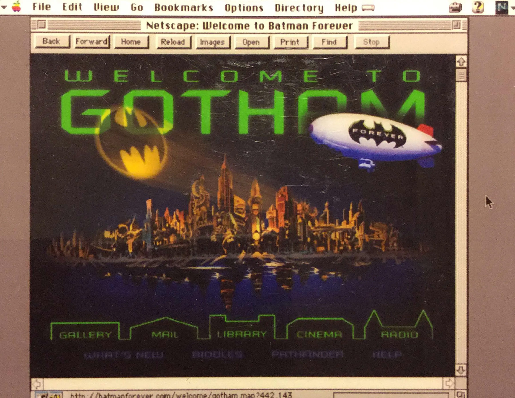
If stripped from its historical context, the Batman Forever website would not be considered a quality experience from a contemporary standpoint:
- Dated aesthetics,
- HTML table-based layout,
- A lack of responsive design,
- Non-Retina images,
- Media stored in obsolete formats,
- etc.
I don’t think it’s fair to criticize such a landmark piece of web history in this way. But I am bringing it up to communicate a larger point: Something that’s considered high quality now may not be in the future.
Quality is ancillary
The build quality and form factor that went into the construction of the Juicero were breathlessly fawned over by the technology press. Puff pieces were quick to point out the Apple-like precision-engineering that went into its construction.
This was until everyone figured out that it was an over-designed, overpriced DRM-locked piping bag squeezer for spinach.
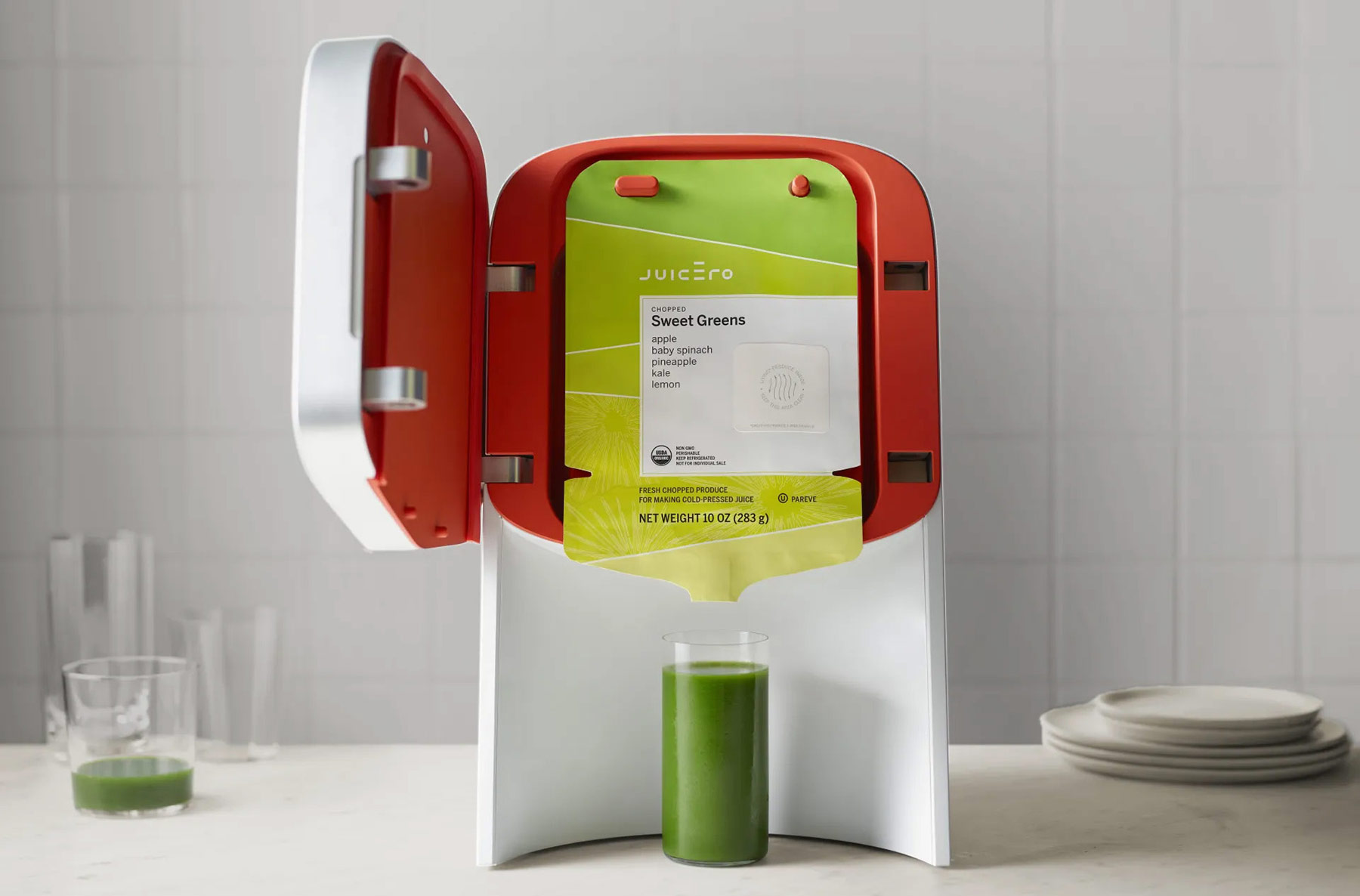
The thing here is that this “high quality” device was built to solve the kind of non-problem that could only arise from the navel-gazing cult that is contemporary Silicon Valley. What we’re left with is just a high quality, high profile failure.
Good thing all that irreplaceable aluminum went into the device’s construction!
Quality is cheap and commonplace
The Navy used to use purpose-built, yet cumbersome control interfaces for its Virginia-class submarines. After feedback from sailors, it swapped out the ~$38,000 devices with ~$20 Xbox controllers.

The new controllers:
- Are far more easy and intuitive to operate,
- Allow for more fluid and natural movements,
- Drastically reduce training time, and
- Are far easier and cheaper to maintain and repair.
These are objectively positive outcomes for everyone involved, save for the company who manufactured the original periscope control system.
Quality is box-checking
As someone who has worked in government and government-adjacent services, I detest the phrase, “Good enough for government work.” I’d need more than ten fingers and ten toes to count the number of people I know who have selflessly pushed for better for the citizenry they serve.
That said, I have a truckload of ire reserved for the user interface that caused the population of Hawaii to get instructed to seek shelter due to a falsely-reported ballistic missile attack.
This:
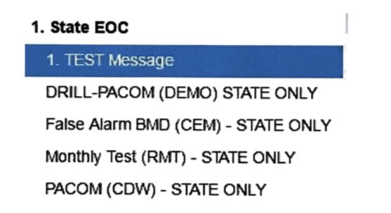
Led to this:

There are contractual obligations that compel a baseline of quality that projects like this must meet. The thing is, the vendor who produced this experience met this baseline—at least on paper.
Quality is boring
The web is chock full of experiences that download fancy typefaces, unskippable animation, scrolljacking narratives, gigantic hero images, full-motion video, intrusive chatbots, and other trendy Awwwards bait.
Standing as a bulwark against these flash-in-the-pan experiences is Craigslist.
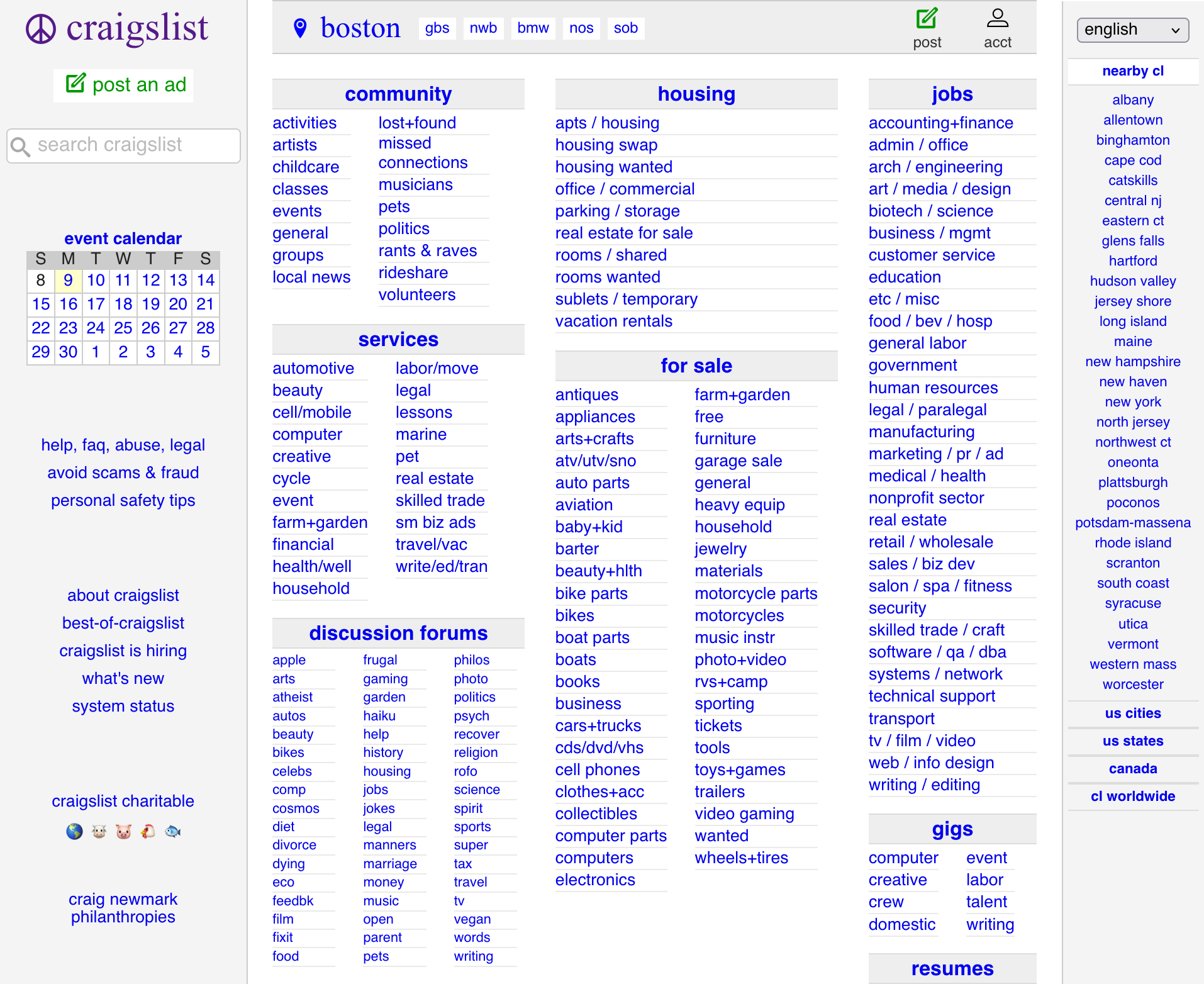
Craigslist features an infrequently-updated, stark and minimal design. It exemplifies brutalist web design since before the term was even coined. More importantly, the site has been connecting people to what they want or need with minimal fuss since 1995.
I don’t know about you, but I’d call a thirty year run a pretty strong signifier of quality.
Quality is a promise
Sonos is known for its immersive audio ecosystem. After establishing its presence in the marketplace via an impressive wireless multiroom audio offering, it went on to invent a whole host of music-related hardware products.
Sonos’ market popularity established its brand reputation as being high quality from a consumer perspective. This perception changed on May 7th, 2024 when they released a disastrous update to their app, allegedly rushed to be ready for the debut of their new wireless headphone product offering.
The app was the lynchpin for the entire Sonos experience. When updated for the worse, everything fell apart to the tune of a $200 million revenue shortfall. It also cost the CEO and the CPO their jobs.
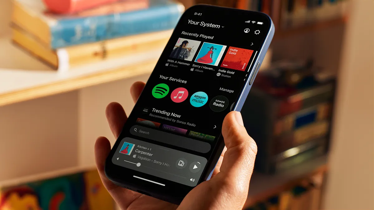
To address this, Sonos has promised a whole host of changes, including a roadmap of updates communicated directly from the top. Furthermore, a “quality ombudsman” role has been created at the company to help ensure this outcome does not happen again—it is unclear what leverage this role will have, however.
All of this rests on the assumption that quality is an unspoken agreement between people and the service they gave their money to. That agreement is that what they invested in will continue to function at the level they bought in at or better going forward.
Quality is a wedge
Apple is updating to use a unified visual language across all the operating systems it owns. This update is sourced from the Vision Pro, its mixed-reality goggles.
Proponents of usability are incensed by this decision, in that the glass-like aesthetic it uses creates serious legibility issues:
Apple products are thought of as high-quality goods. Apple as a brand is percieved as being pro-accessibility.
This aesthetic update is baffling in both regards until you consider the larger picture: Smartphones have market saturation, the Vision Pro is a flop, it’s smart car project was scuttled, and attempts to integrate a LLM into Siri are failing.
As Vitomir Jevremovic points out, requiring GPU-intensive visual effects will make older devices feel clunky and slow. Or, to put it another way: low quality.
With this context, using visionOS’s aesthetics is less sunk cost fallacy from Apple’s perspective and more attempting to create luxury aesthetics. After all, something that feels low quality is likely to be replaced, especially if you’re trying to keep up with the Joneses.
So, what should I focus on instead of chasing quality?
Pride in craft is always important. Just be sure that the craft is serving objective and constructive concerns.
Performance, security, stability, localization, and accessibility are all great areas to invest in. All of these things have objective and measurable aspects to them.
Usability is another great area to invest in, provided the effort is done in a way that it addresses people’s actual needs. To that point, user research is another thing well-worth spending your precious time on.
Quality is whatever someone else needs it to be
Hopefully I’ve illustrated how pointless it is to try and talk about quality by showing how malleable and variable a term it is.
This slipperiness is also something worth keeping in mind if and when you need to contend with other people bringing up the term. Remember that it is a proxy phrase, often born of an inability or unwillingness to articulate other concerns.
In situations like this, work around the term. Figure out what is not feeling right to the person discussing something, consider what their underlying motivational factors might be, and be aware of agendas they might have.