I have worked for two newspapers over the course of my career (three if you count my high school newspaper). One thing I learned there is that the top half of each and every newspaper homepage is a daily battle of priorities.
The idea here is that the thing that is highest, largest, and leftmost on the page will get the most attention.
Placement and ordering of this content is also an expression of the site’s editorial agendas. This is in of itself worth thinking about.
The language of hierarchy
Generally speaking, the most important thing on a page is:
- Close to the start of the document, and
- Large.
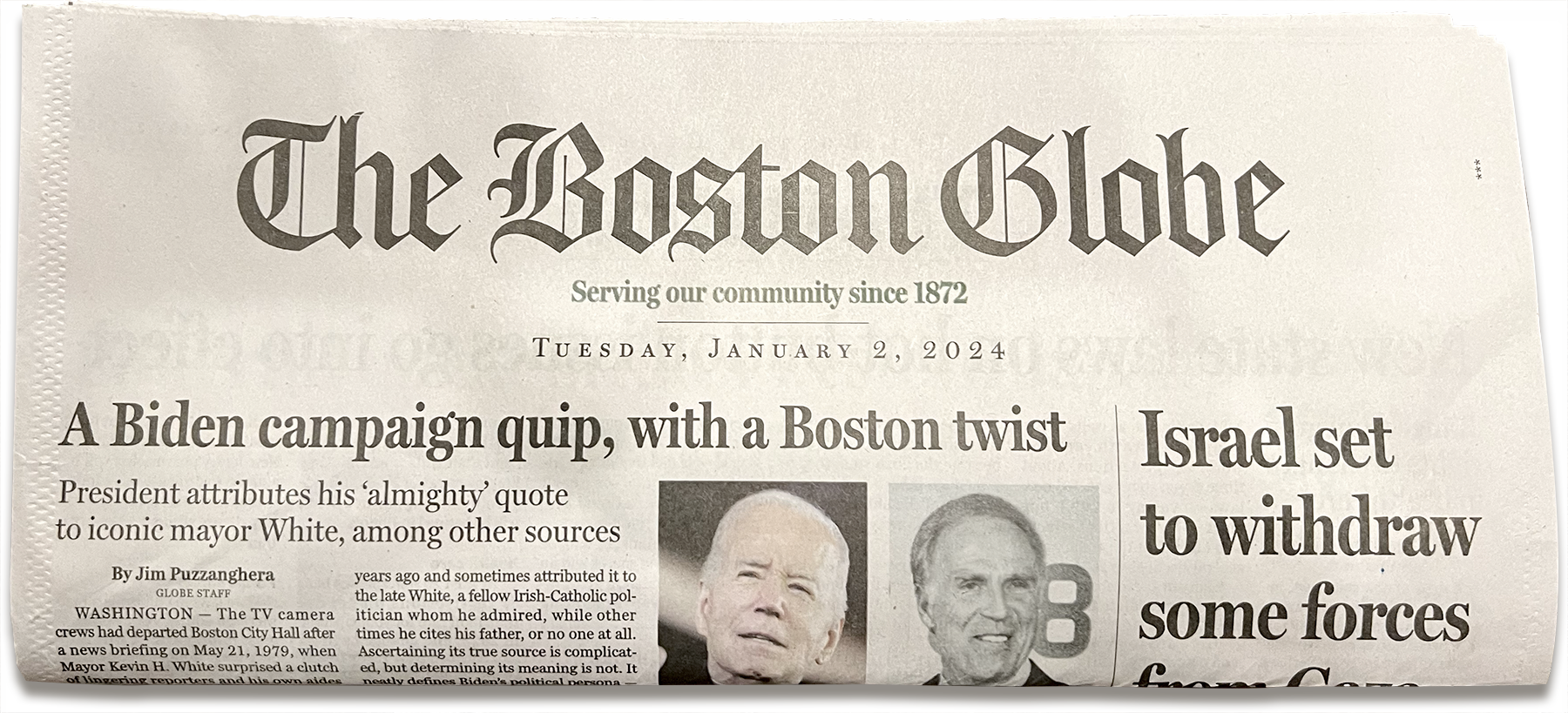
When that page is written in English, that means the top left or top center. Again, think the front page of a physical newspaper:
This is a massive oversimplification of the topic, but also good for steering the main point of this post.
The highest possible priority
The headline for the most important thing for this days’ top news will be the same type size as yesterday’s top news. It will likely also be the same as tomorrow’s.
This consistency and predictability is important. It helps to teach the reader how to parse what the most important things they need to know for that day are.
With this system established it is then up to the reader to determine what of those items are the most important to their specific needs.
That said
There’s news, and then there’s news.
Sometimes something momentous happens. This necessitates a hierarchy of attention that goes beyond the regular flow of information.
In this case the platform is intentionally overriding the reader’s determination process and all but forcing them to pay attention to the thing the platform considers the most important.
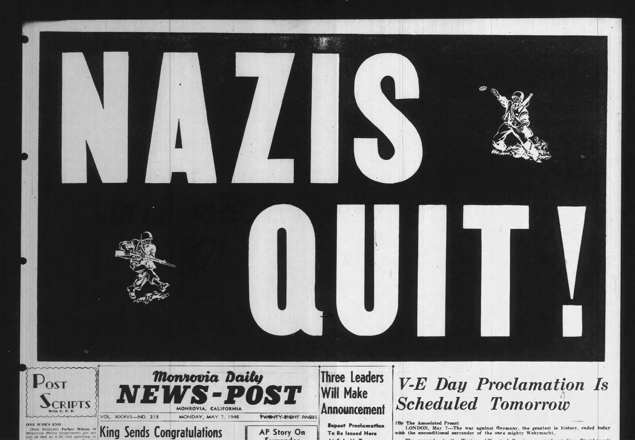
An example of this is World War II ending:
Another personal favorite is from The Onion:
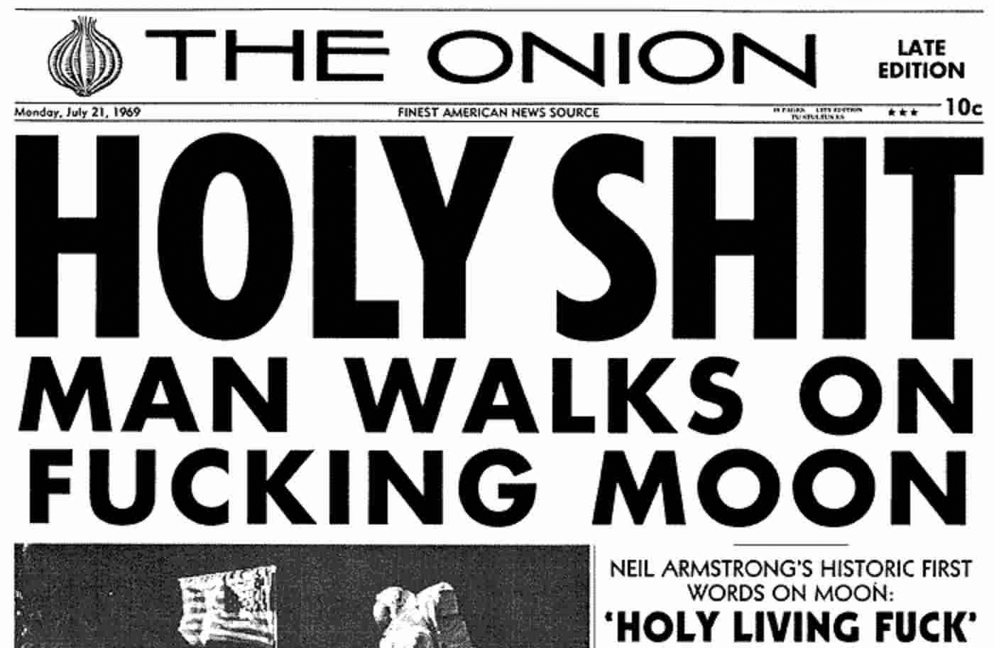
A designer at one of the newspapers I used to work at referred to this visual treatment as an “oh shit banner,” because its use represented something so important that it made you stop in your tracks and go, “Oh shit.”
Rules and breaking them
The headline treatments of oh shit banners are an example of intentionally breaking the rules a designed system establishes for itself. It deliberately forces the attention of the reader.
Someone walking by a newsstand can’t help but notice an oh shit banner because of its visual prominence. Subscribers will also take notice, in that there is a purposeful breaking of the rules they have subconsciously become literate in, and used to.
Oh shit banners on the web
The web has the equivalent, but it’s a little trickier. The practice of putting the most important thing at the top of the homepage is still performed, despite persistent misconceptions about “above the fold” and homepages being where folks enter into news sites.
In that vein, oh shit banners are not:
- Banner ad takeovers,
- Notifications permission requests,
- Cookie consent forms,
- Confirmshame modals,
- Sensational chumbox clickbait headlines, or
- Some other cheap trick used to steal or manipulate your attention.
So, then what is an example of an oh shit banner use case?
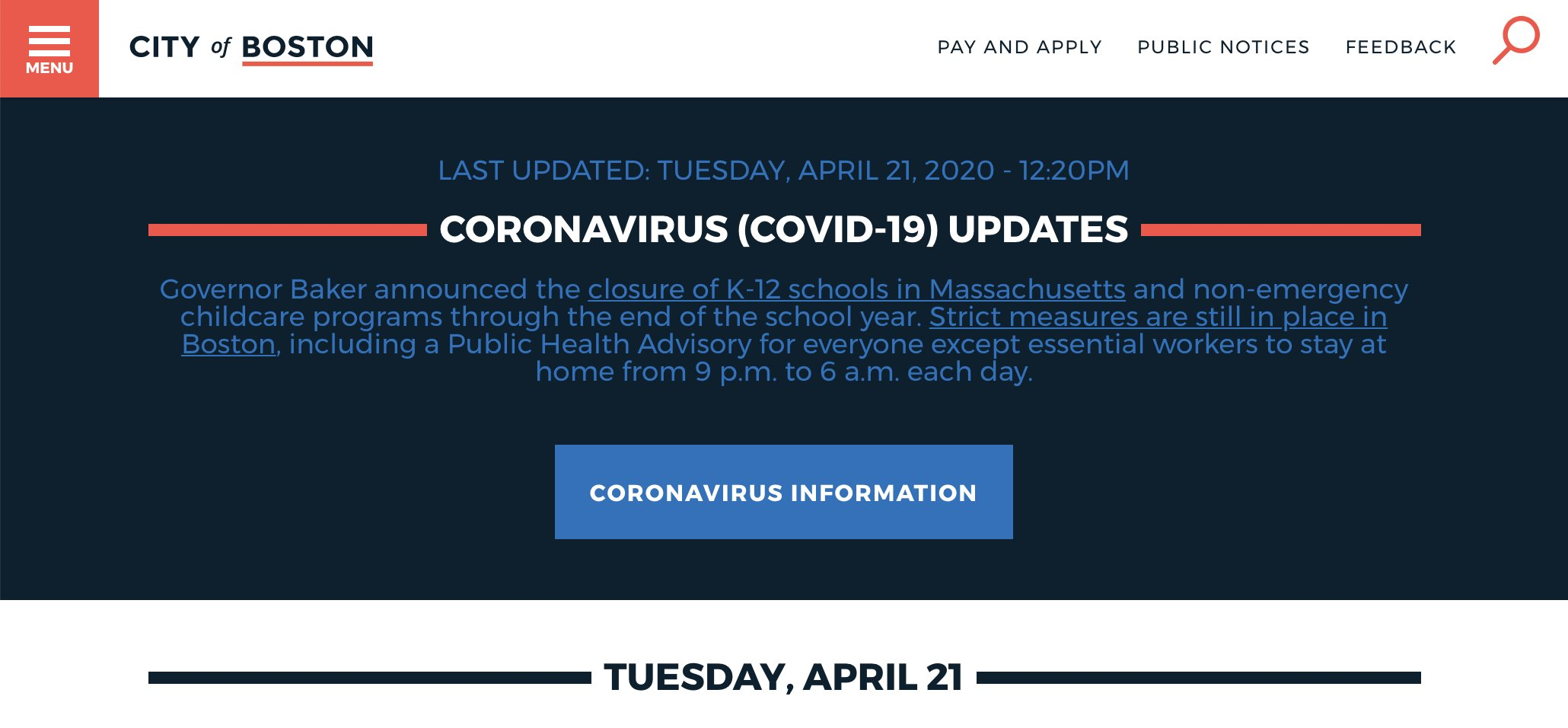
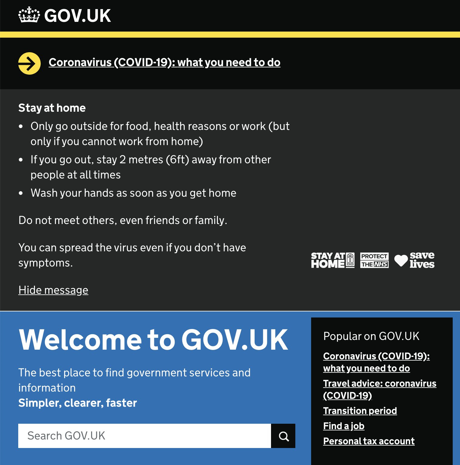
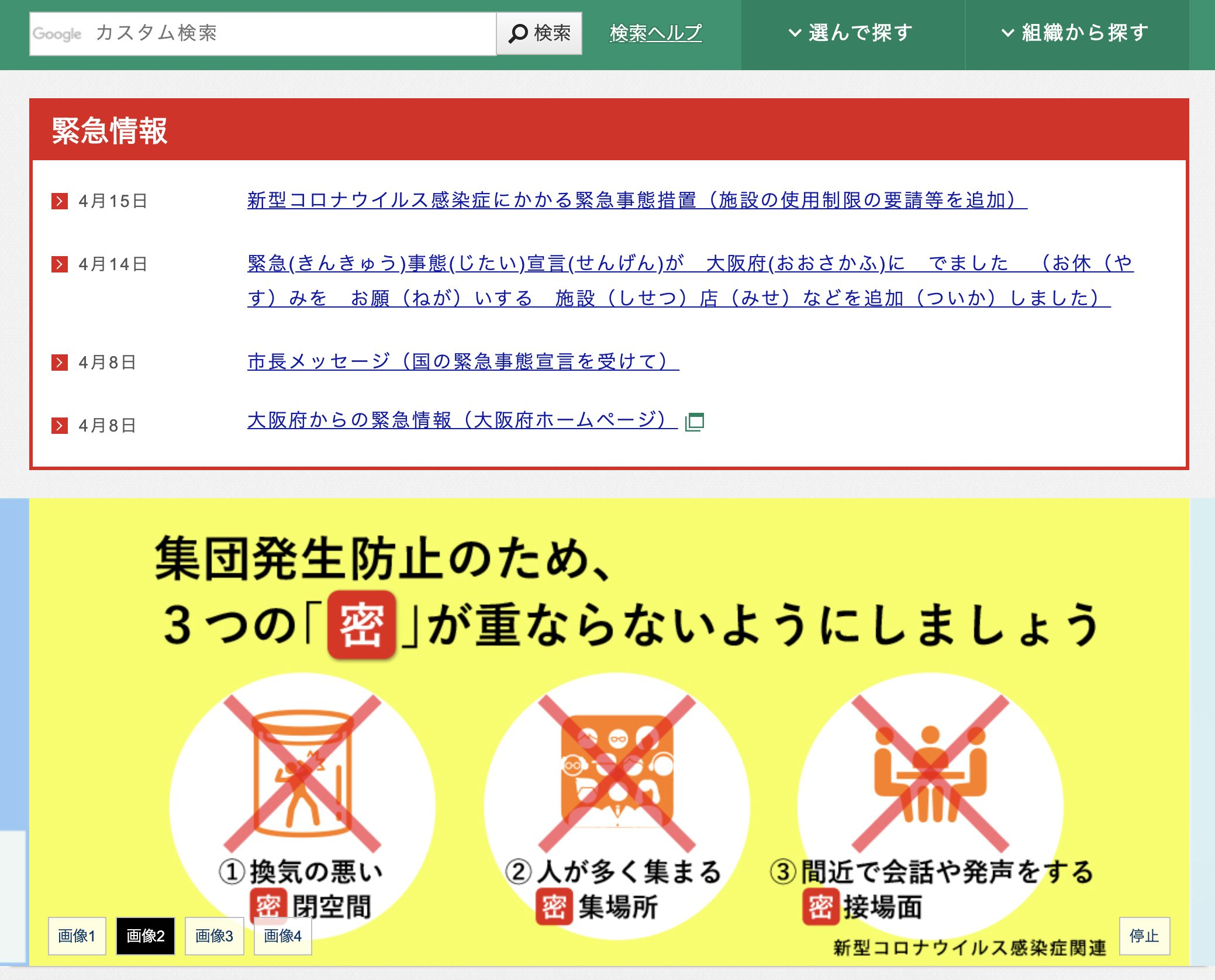
Global pandemic
A mysterious, highly contagious, mass-disabling disease ripping across the planet certainly qualifies as an event where you want people to shut up and pay attention.
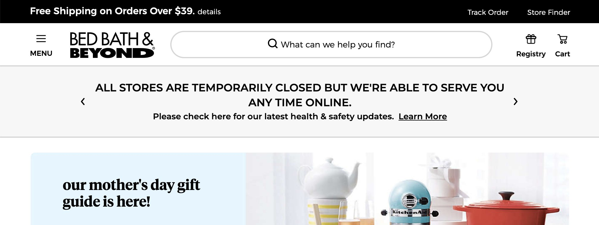
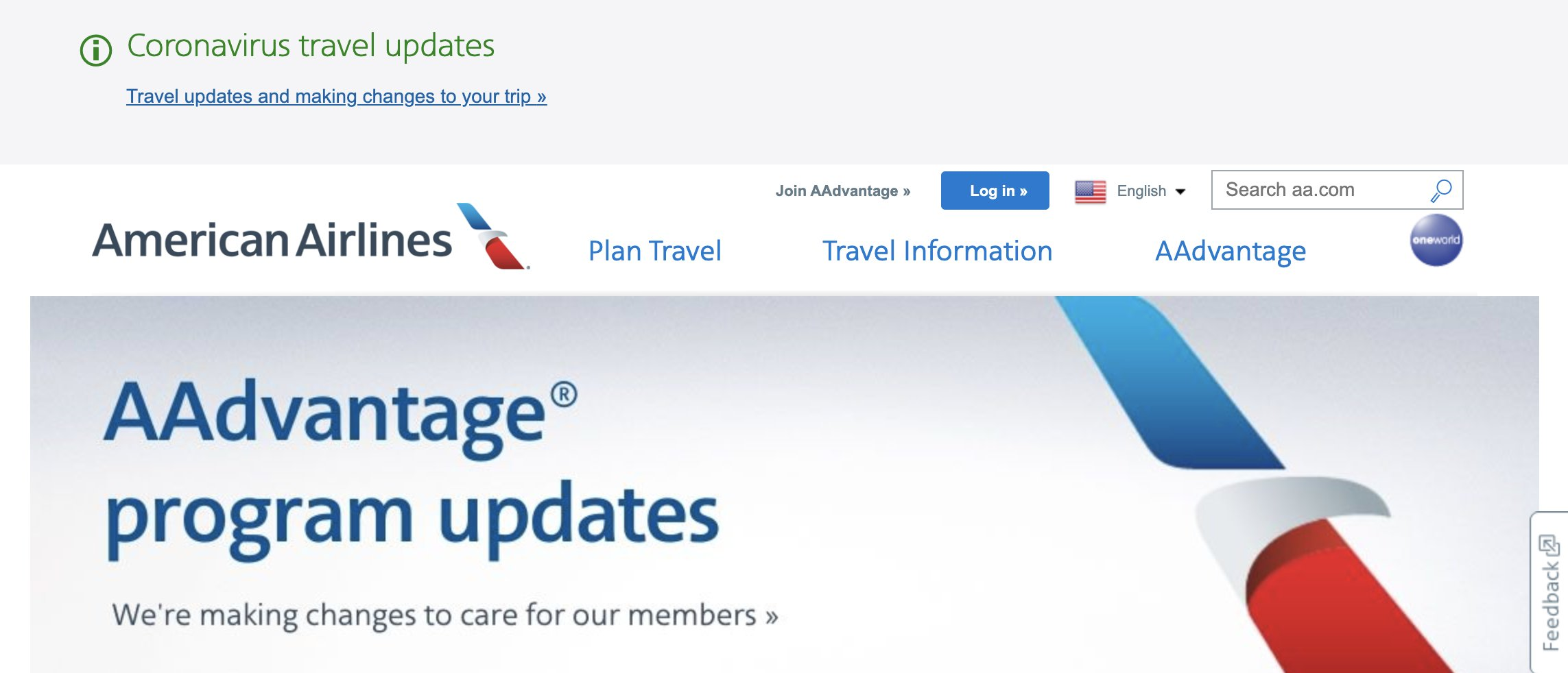
I took some screenshots from a sampling of different websites when the Covid-19 epidemic first started to spread. It is a slice of history whose importance was communicated on the web in a highly specific way.
What else should oh shit banners be used for?
As previously mentioned, things like clearance sales, newsletter subscriptions and the like aren’t candidates for the oh shit banner treatment.
It is not the most inclusive term, but attempting to misuse the oh shit banner for these kinds of content will trigger banner blindness. An entire internet full of manipulative, attention-stealing antipatterns have created this self-defense mechanism.
Chronic misapplication of this design pattern means people will be conditioned to ignore it when it’s time to actually pay attention. This makes the entire endeavor moot.
For the web, oh shit banners' four most likely use cases are for:
- Government emergencies,
- Crisis situations,
- Product recalls, and
- Catastrophic outages.
Government emergencies and crisis situations
These are the most viable of the four scenarios, in that we already have evidence of it:
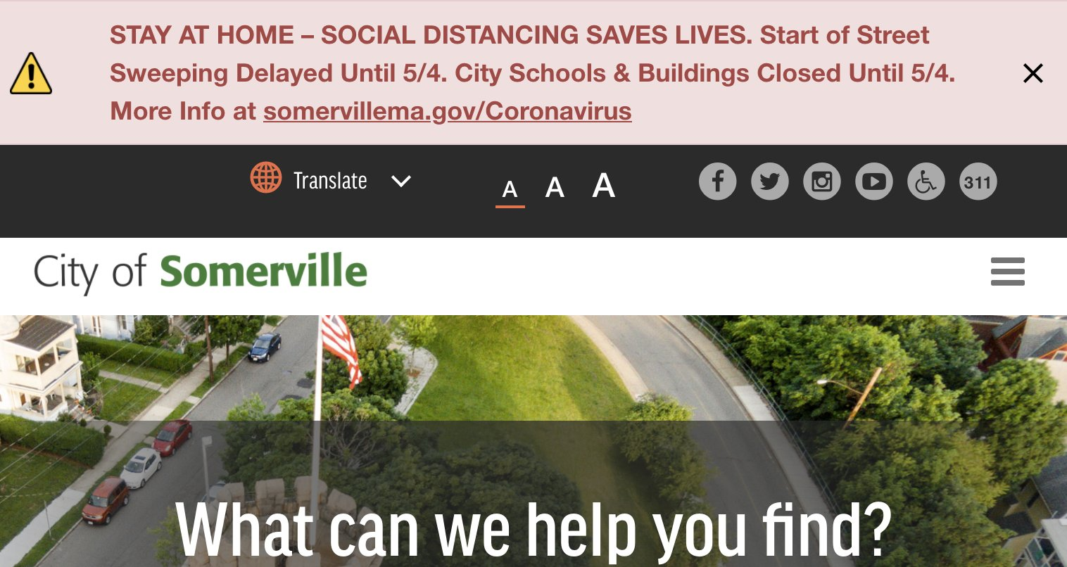
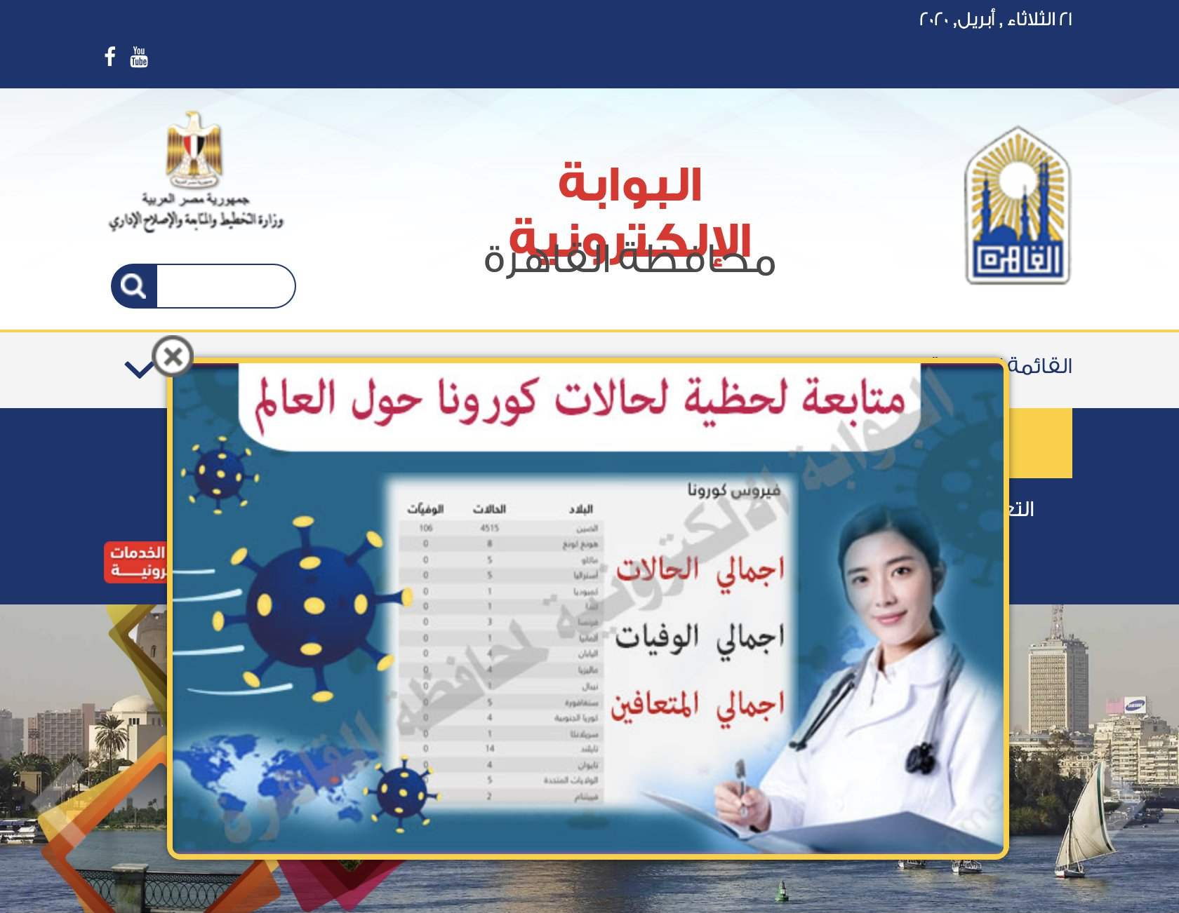
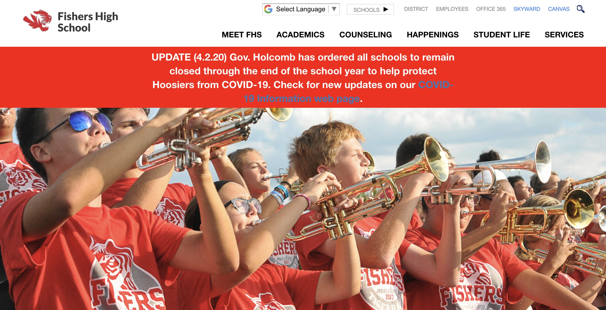
Things were also scary enough that private industry joined in on communicating a societal-grade crisis. Most of the company homepages I visited repurposed existing design system patterns, however:
Product recalls and catastrophic outages
These two are a little more tricky in that they happen more often than we’d like to think for private companies.
Recalls occur when a product unintentionally creates harm. An example here is pathogens in mass-distributed eyedrops that caused illness, blindness, and death.
A catastrophic outage is a instability introduced into a system that results in data being ruined. This can be a circumstance that:
- Prevents data from being actively transmitted and stored,
- Destroys previously stored data, or
- A combination of both of the previous events.
Companies are not incentivized to communicate the level of seriousness these two types of crisis necessitate. This is largely because:
- Failure states and their root causes are infrequently considered or prioritized, and that
- Calling attention to such a state will translate to negative press and the stock price taking a hit.
For example, Amazon’s web storage service suffered a highly public outage in 2017. Here is the icon they used to represent the status of this event:

This repurposed treatment makes sense if you recall the private industry examples listed previously. By this, I mean that the people who created this UI likely:
- Did not have the time or budget previously allocated to create catastrophic failure state guidelines,
- Had to pick something in the middle of an actual crisis, and also
- Faced internal pressure to downplay the crisis’ severity.
Design systems
Codifying an oh shit banner treatment is something worth considering for any platform that needs to communicate important information during a crisis.
Government services and private industry are both contenders for adopting this pattern. In addition, having this pattern proactively established can help in a time of crisis, the same way having a defibrillator on-hand at the office can.
The logical place this sort of pattern should be codified is within a design system, provided the organization has one. Use of an oh shit banner in a design system is also an example of how governance is just as, if not more important than facilitation.
Governance, guidance, and guardrails
It is relatively straightforward to make a large banner and add it to the top of a homepage of a website. It is also relatively straightforward to document said banner.
However, these actions don’t do much in terms of responsible use. The real questions you as a design system maintainer need to answer are will an oh shit banner have:
- Language indicating it should only be used in a time of crisis?
- Systems and automation to detect misuse?
- Incentive structures to prevent abuse?
- Process to identify who the person responsible for deploying the banner is?
- Additional process to identify a path of succession if that person is unable to deploy?
- Examples of copywriting that will communicate the crisis in clear and concise way that does not create additional panic?
- Recurring meetings to ensure all the previous policy and process is up-to-date?
To be clear: I don’t have the answers to these questions. That’s something only you can answer with the full context of the organization you are developing the pattern for, its specific needs, and its own unique processes and workflows.
Who has access?
You may also want to consider instituting privileged access for using a pattern like this.
I haven’t encountered password or team-based access on a design system before. Think of it like the two keys it requires to launch powerful missiles.

It is not a perfect solution, in that people will inevitably copy/paste things if they can’t quickly access them. However, the paper trail and intentional friction could be enough of a deterrent effect that this approach may be worth considering.
Other design patterns might also be contenders for this sort of access-based approach, especially ones that deal with how highly sensitive information is displayed and manipulated.
Regardless, having something planned for and ready to use—even if it’s to communicate something terrible—might be worth preemtively expending the effort to do.
May you never have to use, or read an oh shit banner
We live in a world where horrible, unpredictable events can happen. However, patterns like the oh shit banner allow us to do something about that fact by helping to lessen the scope of harm these events create.
The oh shit banner pattern is one that you should use with an extreme amount of caution, and only for disasters where clearly communicating helps to preserve safety, stability, and security.
Creating and using an oh shit banner treatment requires investment in process as much as, if not more than it does a technical implementation. This may require interrogating your organization’s policies and priorities, but does so in the service of communicating vital information at a critical moment.