More than one thing can be true at the same time. For this post, it’s that:
- Have recently felt a lack of control in many of aspects of my life,
- I’m still technically a designer, and that
- I like CSS a lot.
Because of this, I’ve found a new worry stone: my Mastodon instance.
Updated visuals
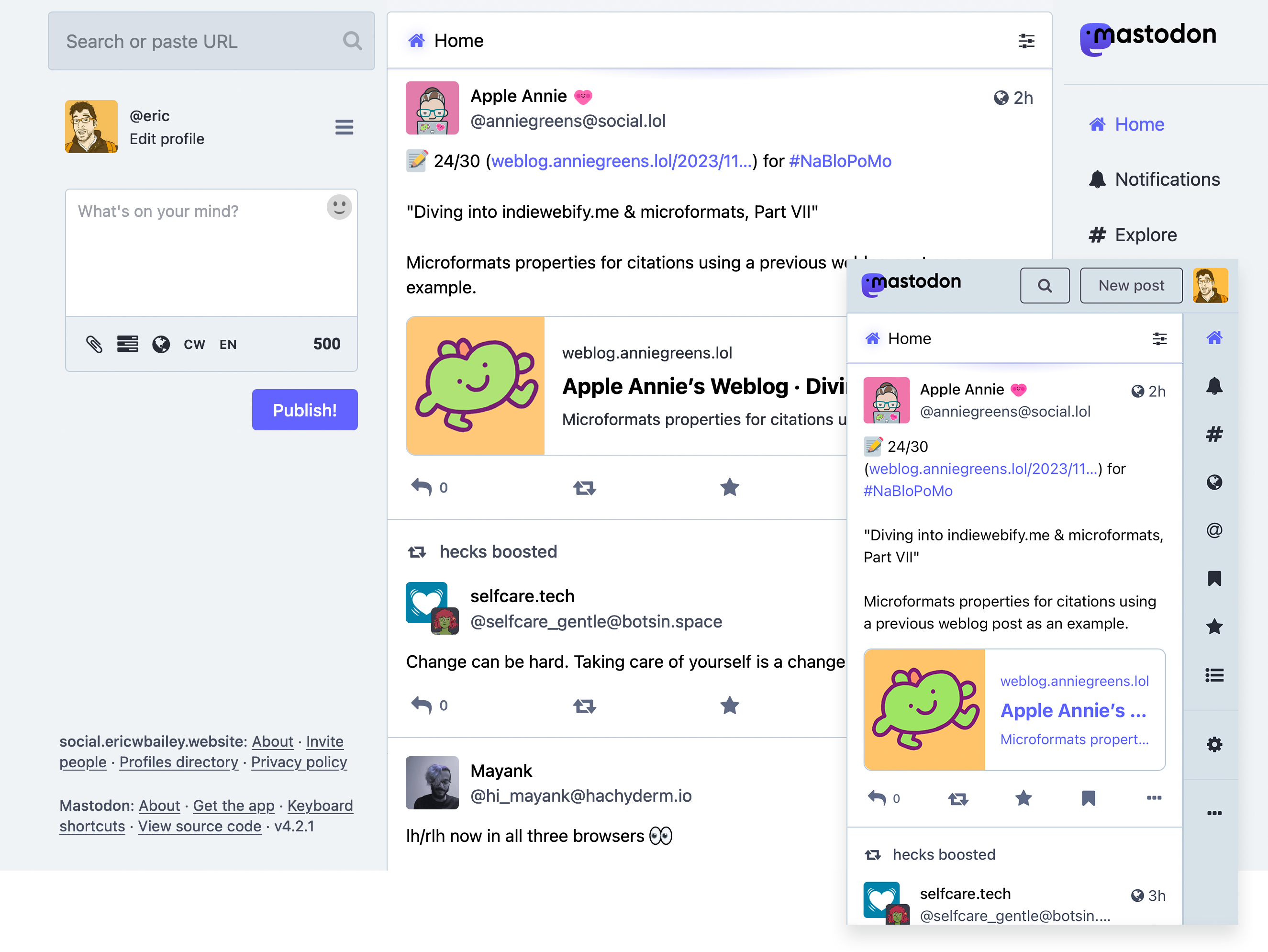
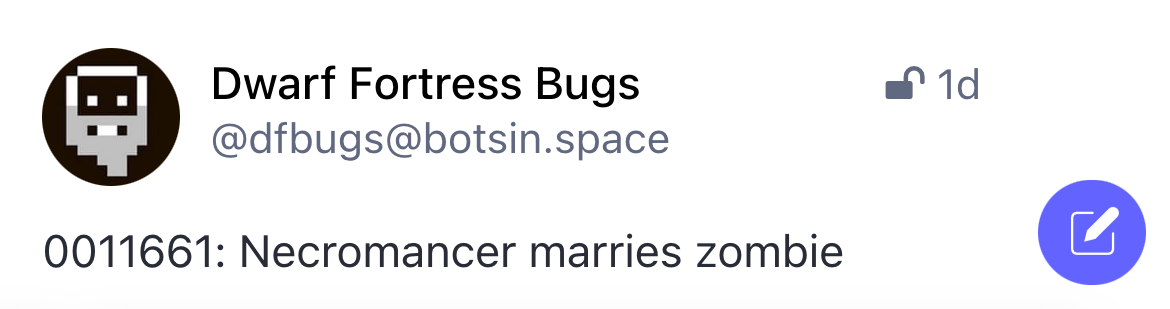
This is how my Mastodon instance used to look:
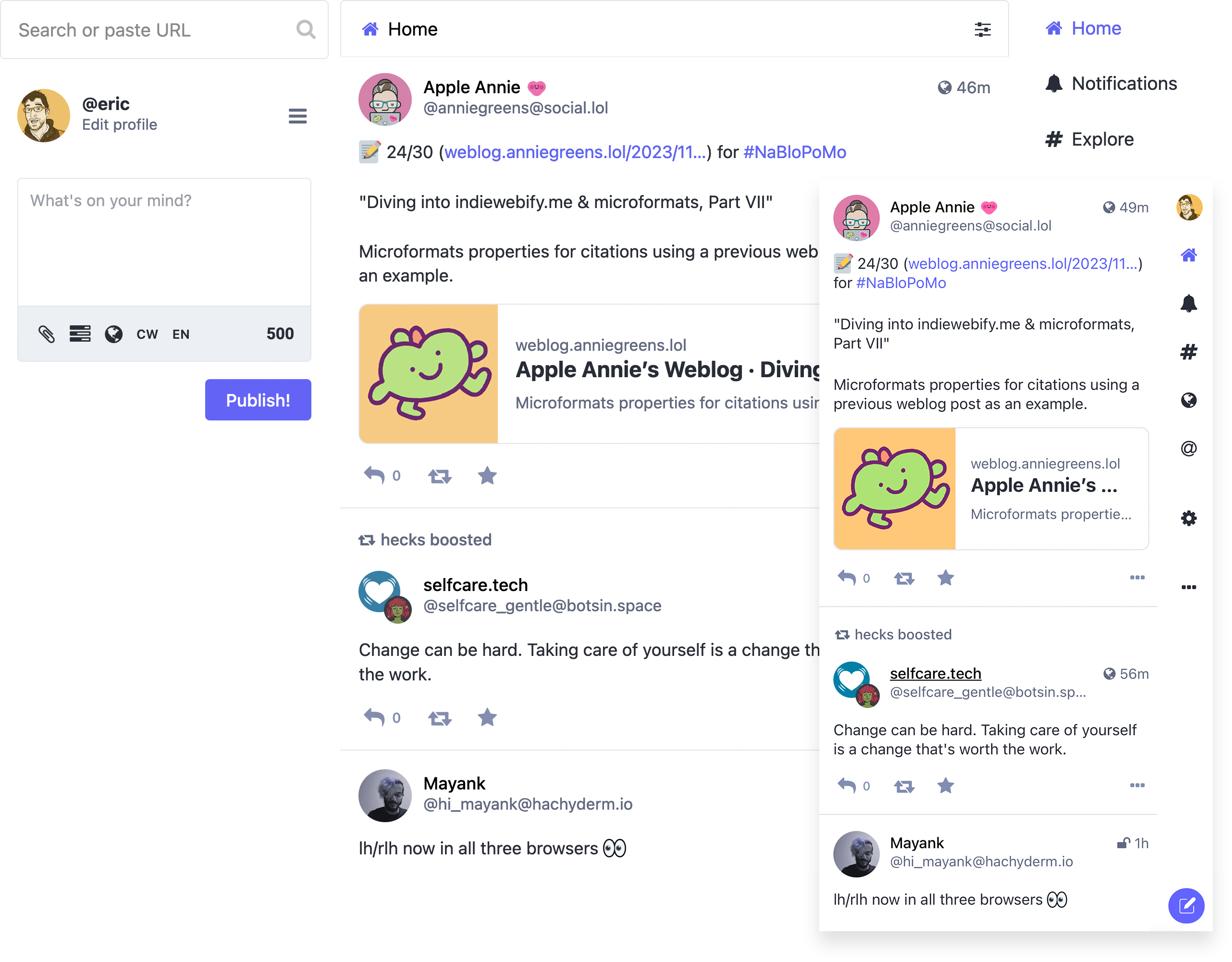
And this is how it now looks:
I used to use a Stylus browser extension to tweak the visuals of my Mastodon experience. For some unknown reason it stopped working. In going to fix it, I figured I could instead:
- Use an existing, baked-in instance feature,
- Make the styling automatically work on any device that I log into, and also
- Turn what I see into what others can see.
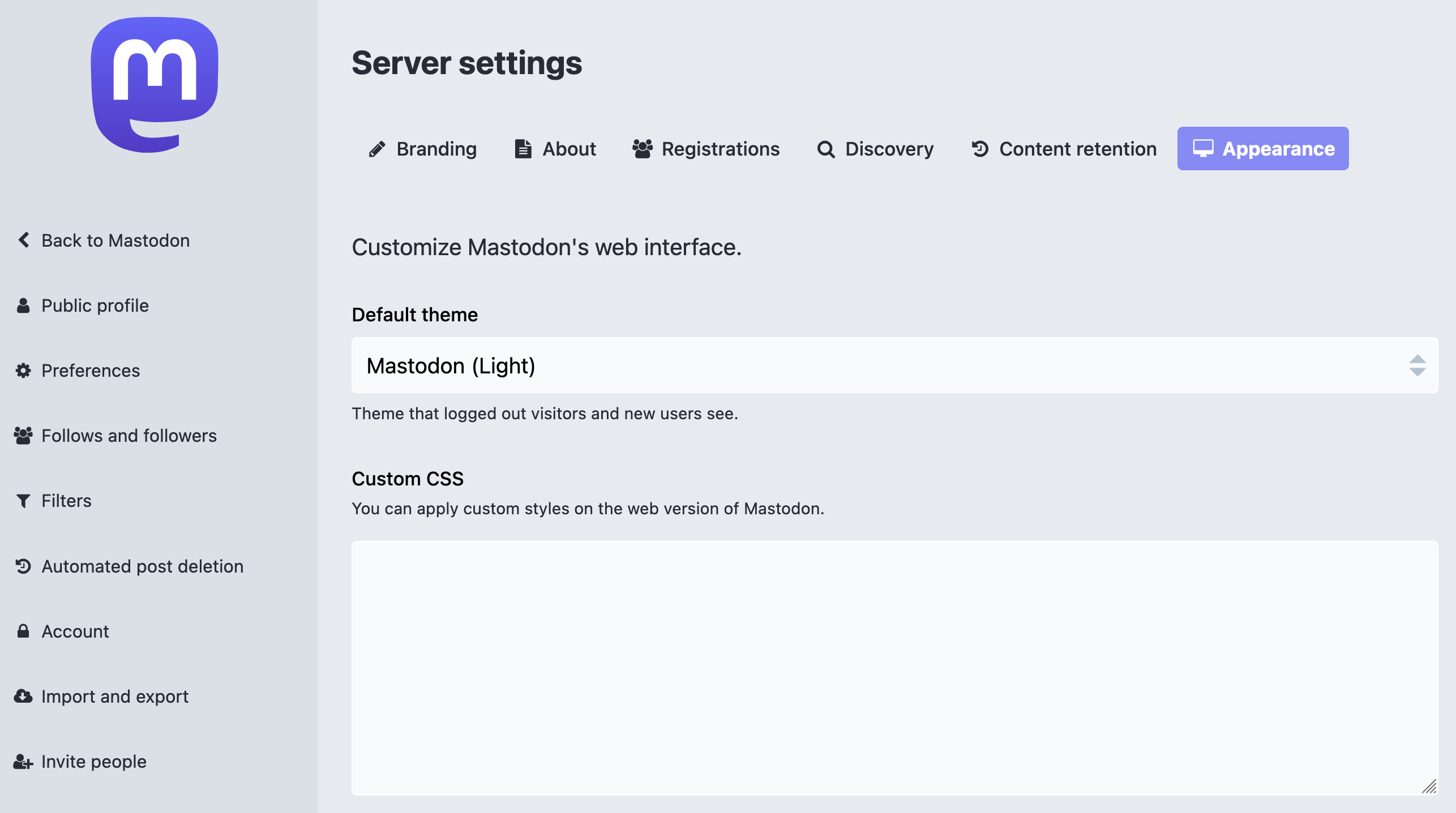
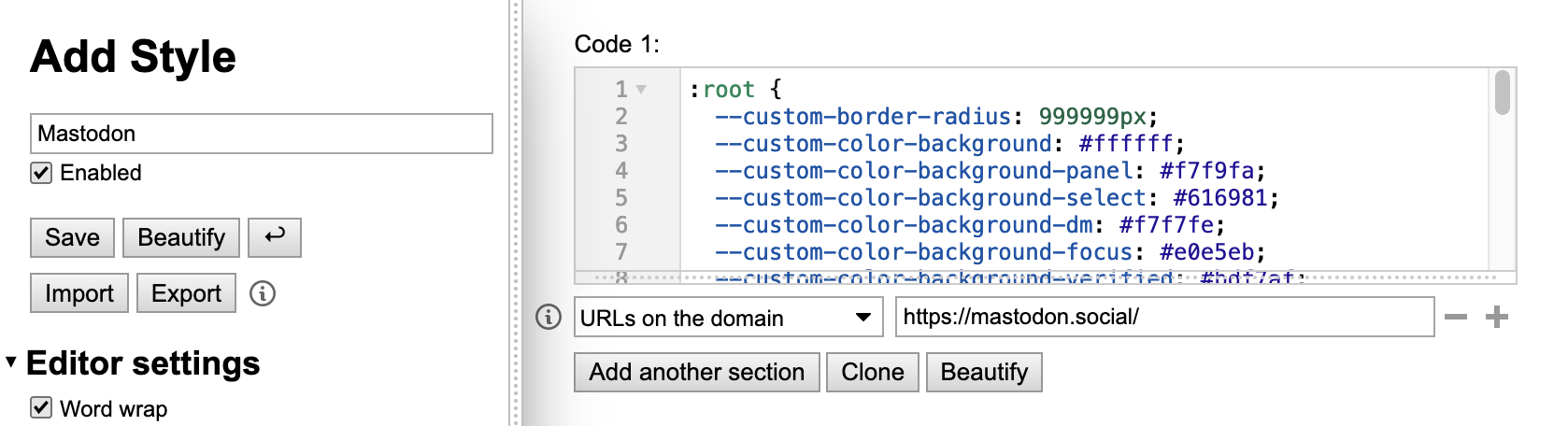
If you run a Mastodon instance you can tweak its CSS MySpace-style via a setting buried deep in Mastodon’s preferences. It is located in Administration, then the Server Settings subpage, then the Appearance category located within that.
Let’s talk about code
The CSS I wrote isn’t pretty.
I’m sure I could dig through Mastodon’s source code, chase down the higher-order logic, and then construct something more elegant. However, the tangled nest of selectors, comments, and !importants I wrote are good enough to get the job done. And that’s just fine for my immediate use case.
Specifically, :where()' ability to lump selectors together and affect their specificity does a lot of the heavy lifting. Namespaced, human-friendly Custom Properties also help a lot, in that values now make a lot more sense when scaffolded across all these different co-opted selectors.
I’m sure I could also do some fancy things with Cascade Layers, CSS nesting, and maybe eventually @scope. But that is a not-right-now-problem.
Archeology
It’s interesting to go spelunking in someone else’s code, and then try and reverse engineer the decisions that went into it.
One thing I immediately noticed is that Mastodon ships Sass source maps to production, so you can see what declarations are coming from where. This, in turn, helps me construct a better picture of how they made what they made, as well as potentially why they made the choices they did.
It also has the hallmarks of a large open source project. There’s certain areas that feel like they’ve been developed in isolation, and other areas that feel like part of a larger, more organized vision.
There’s also some interesting, slightly dated front-of-the frontend technical choices to contend with. An example is the boost button, which uses a background image SVG data URI to achieve its animation effect. Compare to the other post button icons, which use an icon font.
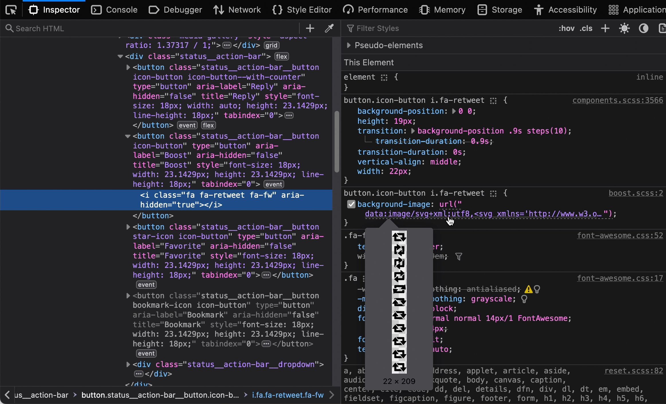
To get around this, I wound up having to use a brightness filter to ensure every icon—regardless of the technique used to generate it—gets the same visual treatment.
This approach is a little hacky. It is also a great example of CSS’ versatility and ability to work with other technology’s constraints when wielded by an experienced practitioner.
Another fun thing I do is conditionally making the post button into a floating action button on smaller screens, and then inject an icon into it:
Let’s talk about choice
Mastodon chose a human-friendly, BEM-style approach for its class names. They also chose to allow instance owners to be able to provide their own styling.
These choices mean that I, as a consumer of their technology, can make modifications to their UI. It also means I can make these modifications with a relatively high degree of confidence.
<!-- I'm pretty sure this class controls the account display name's appearance -->
<span class="display-name__account">…</span>
Compare this to services like Twitter, Bluesky, and Threads. The robot-friendly class names these services use prioritize code optimization.
<!-- Uhhh -->
<span class="css-1qaijid r-bcqeeo r-qvutc0 r-poiln3" style="text-overflow: unset;">…</span>
My options are a lot more limited as a consumer of these other technologies.
Because of the choices these platforms made, I typically need to find an errant, more stable attribute declaration in the code instead. Then, the hope is that it provides enough of a surface area to modify what I need to (aria-label declarations are helpful here).
has() may also help out a lot when working upwards and outwards from an attribute selector, as well. Given its potential capability, I am honestly surprised it was greenlit as a standard in our current anticompetitive, user-hostile environment.
More than a coat of paint
I’ve made specific tweaks to Mastodon’s UI to reflect my own particular needs. I’ve removed the bookmark button from posts, as I don’t use that feature. Same for some other primary navigation options, as well as notification banners that refuse to stay dismissed.
I’ve also made some other adjustments to help how my brain likes to process this kind of visual information.
One tweak is to set a maximum width for post content and a more legible (to me) line height. Another is to visually de-emphasize secondary content such as timestamps and the hashtag bar so as to call better attention to actual post content.
I also made more sweeping layout adjustments that work in conjunction with these smaller modifications. This creates what I consider a more minimal and harmonious overall experience, one that aids in my reading and comprehension.
In this way, my CSS is an interface.
I am able to extensively modify my instance’s UI to suit my specific needs because of deliberate architectural decisions Mastodon’s maintainers have made. Anyone else with enough time, dedication, and knowledge can do the same. And that’s pretty damn cool.
Couldn’t you have just used Elk?
Elk is an alternate client service for Mastodon. My visual styling choices look a lot like many, but not all of the choices that they have made.
I also wanted to remove some complication and mental overhead from my social media efforts. Occasionally updating a stylesheet I control is a lot less work and risk surface area than managing an entirely separate client.
Other people might be into doing this sort of thing, and that’s totally fine! It’s just not for me.
What if I don’t run my own instance?
You can install Stylus, dump the code I wrote into it, scope the style block to your instance’s URL, and then let the browser extension work its magic.
You can also tweak the code I wrote. I might suggest playing around with the Custom Property values first, and see how that affects things. Again, I’d like to re-stress that the ability to do this is one of the strengths of the web.
Why is this saved in a Gist?
The reason this code is saved in a Gist and not a full-blown project repository is that I’m not really interested in supporting issues or enhancements.
I’ve got enough on my plate already, and turning this effort an unpaid part time job is not a priority. I think this is also totally fine, despite some folks’ weird notions around demanding free labor from others.
But, I’m fine with the Mastodon UI the way it is!
Cool. I’m happy it works for what you need!
Are you aware you made it look like Twitter? Mastodon isn’t Twitter!
I’m aware!
So, are you suggesting that open source projects need to consider usability in addition to technology in order to gain more widespread adoption?
I’m not not saying that!
Are you also implying that an industry-wide devaluation of a core part of the web platform, combined with unnecessary over abstraction of other areas may indirectly lead to artificially limiting people’s agency?
Heavens! I don’t know where you’re getting that from.
Are you interpreting these rhetorical questions as a signal to strike up a debate, despite no explicit signal from me that I want to participate such an activity?
Maybe you could blog about it instead!
Is the previous preemptive positioning endemic to larger cultural issues with the platform?
Well, then where will you go from here?
I’m mostly done creating and editing these styles.
If there’s a significant change to the Mastodon UI I’ll likely update the Gist to accommodate it. Until then it might get a nudge here or a tweak there, but probably nothing major.
I might also encourage you to think about the web experiences you use every day, the choices the people who make them made, the choices you make in interacting with their choices, and the agency you have as an individual to do something about it.