404 pages are what a server will show you if you request something that isn’t there. Another way to say this: 404s are a last-ditch effort to help visitors get what they want if a webpage isn’t there anymore.
There’s plenty of articles out there about how to make entertaining, quirky, and fun 404 pages. And that’s kind of the problem.
Since you’re never supposed to see a 404 page, there’s the notion that this is a chance to flex your creative muscles—a little Easter egg joke shared between web professionals. The problem is that this delight oftentimes comes at the expense of usability at a critical moment.
I’ll explain this further by burning a bridge.
Years ago, I worked for Boston Globe Media Partners (BGMP), a media organization that owns both the Boston Globe and Boston.com.
If you are unfamiliar, the Boston Globe was the first commercial responsive website, proof that Responsive Design worked at scale. It was a monumental achievement. I was not involved with this redesign, but I took the job because of it.
Boston.com is a living fossil, a holdout from the Dot-com bubble. It is impressive in its own way: It hosts a huge corpus of local content, and is a rare example of a still-functioning mass-consumption website that is a quarter of a century old.
For a variety of reasons, BGMP likes to pretend Boston.com doesn’t exist. Most notable is its dabbling in revisionist history with regards to the movie Spotlight and the Catholic Archdiocese sex abuse scandal.
You might be wondering, “How is this connected to 404 pages?” Now that I am now free of its toxic, capricious, and incompetent upper management, I can tell you.
The redesign
With a change in management came the desire to update Boston.com’s design and content management system.
If you make websites, a thing you should know is that complete redesigns are oftentimes political, and not stemming from user demand. It’s a move to claim ownership over those who came before you.
I’ll spare you the gory details, but the redesign had all the hallmarks of an endeavor doomed to fail. The bit that’s important is my former coworker who was tasked with taking the new design direction and creating an updated 404 page.
They did a magnificent job.
A good 404 page understands that a visitor is not expecting to see it. Its appearance is a jarring and unexpected interruption to an expected or anticipated flow.
It is vital for a 404 page to pre-empt the negative feelings that come from these subverted expectations and include:
- Simple, direct language free of jargon,
- An acknowledgment that this experience is the result of an error, and importantly, an error the visitor didn’t create,
- Options for what to do, and
- Locations they could go to instead.
Providing this information meets a person where they are in a state of crisis, and provides a clear and straightforward way to get them back on track.
If you are technologically literate, chances are good you understand what a 404 page is. If you’re not, there is a whole host of negative emotions encountering one can create. The worst of those feelings is that the error is something that they’ve somehow created.
The other thing is 404s can still be quirky! In fact, a thoughtful application of content design can help assuage the concerns of someone who unexpectedly finds themselves on one. Just make sure that their immediate needs are met before trying to get creative.
Politics
The problem is, if designers don’t have organizational clout the scope of change they can affect is limited.
As mentioned earlier, redesigns are political. Since 404 pages are seen as fun, it was perceived as an opportunity to extract a little joy from the grueling redesign process. A manager overrode my coworker’s design and went with this instead:
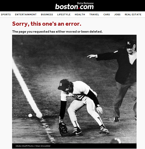
The manager got to have their selfish moment of fun, and this is what went live when the redesign switch was thrown.
Antipattern
This design is the antithesis of a helpful 404 page.
If you aren’t familiar with baseball lore, the photo is meaningless. Yes, Boston does love baseball, but it is a huge assumption to make that every visitor is a fan (there’s also smaller sub-assumptions that you’re specifically a Red Sox fan/enemy and over the age of 40ish, but I digress).
This design immediately segregates the audience into people who get the reference and people who are left out. Not a great idea considering you’re already not happy to see this page in the first place.
This design was also a hard stop. It doesn’t indicate who may have moved or deleted the page, or why. There was also no instruction on:
- Whose fault it was,
- What to do about it, or
- Where they could go instead.
Yes, the primary navigation was used in this template. But someone in charged emotional state is far more likely to close the tab than use it. Better to meet the person where they are and present straightforward error recovery options inline.
Slow boil
When I said “the redesign switch was thrown,” I meant it. The other problem with this 404 page design was that the strategy was to suddenly update Boston.com without warning.
From a reader’s perspective, this update was completely arbitrary. Boston.com had hundreds of thousands of readers, many of them who were loyal daily visitors. The backlash was immediate, understandable, and entirely predictable.
Since Boston.com has been around for over two decades, it also meant that regular readers were extremely used to how the site looked and behaved. Many of them had also built up muscle memory for how they interacted with its content.
Slapping “beta release” on the logo wouldn't cut it.
For this kind of audience, it’s a far better approach to slowly update the design in small pieces over time. This side-steps the shock of a sudden change. Additional benefits of this approach are:
- Being a far smaller engineering ask, and
- Being able to perform qualitative user research to course correct as you go.
On top of this, Boston.com shut down its forums. This feature contained a community of self-moderated, diehard users who had formed organically over the years.
Boston.com forum members represented users who came to the site of their own volition multiple times per day. They were so motivated that they willingly and repeatedly slogged through one of the worst ad experiences on the web.
System shock
Managing a huge inventory of content is a difficult, yet important thing to do. Replatforming the content management system that controlled this content in the middle of a dramatic visual update is anything but ideal.
The end result was the 404 page getting shown to site visitors over and over again after the redesign switch was flipped.
Many visitors were confused about the update, or who couldn’t access their favorite parts of the site anymore. Many were also panicked and looking for answers, but got a trite joke instead. And the thing is: they didn’t need to be there.
Sometimes the 404 was because a page had been deleted. Sometimes it was because a redirect URL didn’t work as anticipated. Sometimes the culprit was performance problems, where many users frantically navigating around caused even more errors to get generated. In this case, other status codes should have been used, but the redesign’s arbitrary deadline and consequently breakneck pace didn’t allow for such considerations.
The end effect this created was a lot like visiting your favorite restaurant after learning they updated their menu, only to have them repeatedly slam the door in your face until you left. It is an understatement to say this made an impact on the daily number of hits—and not for the better.
Did the 404 page’s design unmake Boston.com? No, but it sure didn’t help.
A problem can be two things
The surface-level design issues of the 404 page caused it to fail. However, the page’s design was a symptom, and not a cause.
Vanity is almost always at odds with user needs. Organizations where domain experts aren’t structurally empowered to practice their craft are the real issue. On top of this, a disconnect between management and actual users acts as a crucible for failure.
The best way to avoid this? Carefully cultivate a healthy organizational culture that promotes things like open dialog, constructive critique, and knowledge of the product and the medium at all levels of the organization. This takes deep, intentional, and oftentimes painful work.
Screaming into the void
I need to stress that there were incredibly smart, talented, passionate people working in BGMP’s trenches—great people doing good work and producing miracles on the regular. Some are still there, fighting the good fight.
I should also note have some lifelong friendships forged from my time there, and consider myself incredibly fortunate to have them. Some of them I’m even lucky enough to have been reunited with in a work context (hi Elaina!).
The problem of good work is it requires good culture to be recognized. The problem of good culture is it’s highly subjective. The purpose of a system is what it does.
For me, it was a question of diminishing returns. I do think part of a designer’s role is pushing for institutional change, but it requires a structure where the institution is willing to listen.
Present day
The current 404 for Boston.com looks like this:
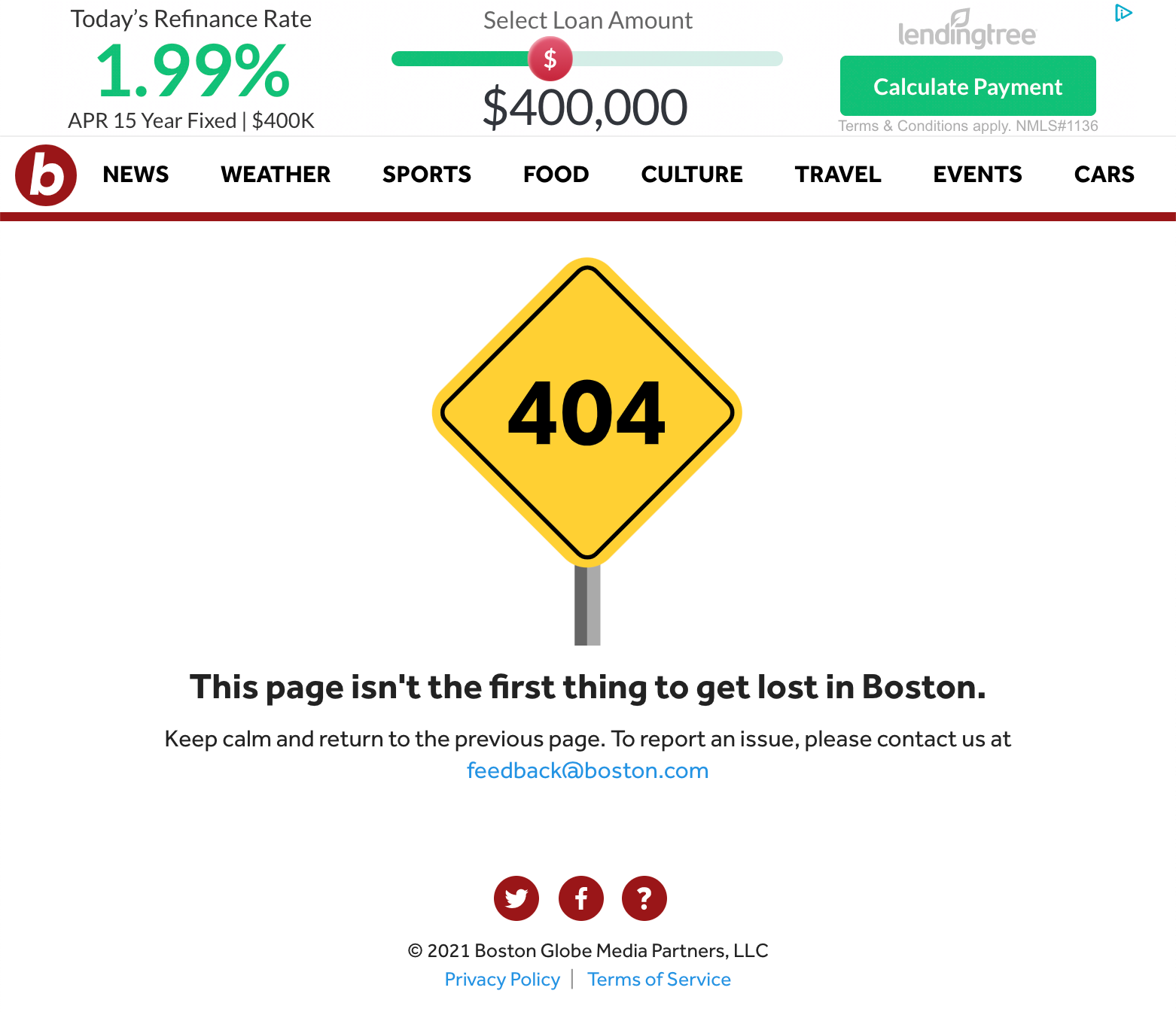
It’s a little bit better, but honestly still not too great. I guess at this point the damage has already been done.
Update: Boston.com re-redesigned on May 13th, 2021. The 404 page design was overlooked.