I’ve been taking screen reader lessons. I found someone who is kind enough to offer their time and expertise (and grace in answering the occasional ignorant question) in exchange for payment.
The goal here is to uncover assumptions I carry with me when using assistive technology, in order to make my work better. It is my hope that this can translate to experiences that people who use assistive technology consider intuitive and pleasurable to use.
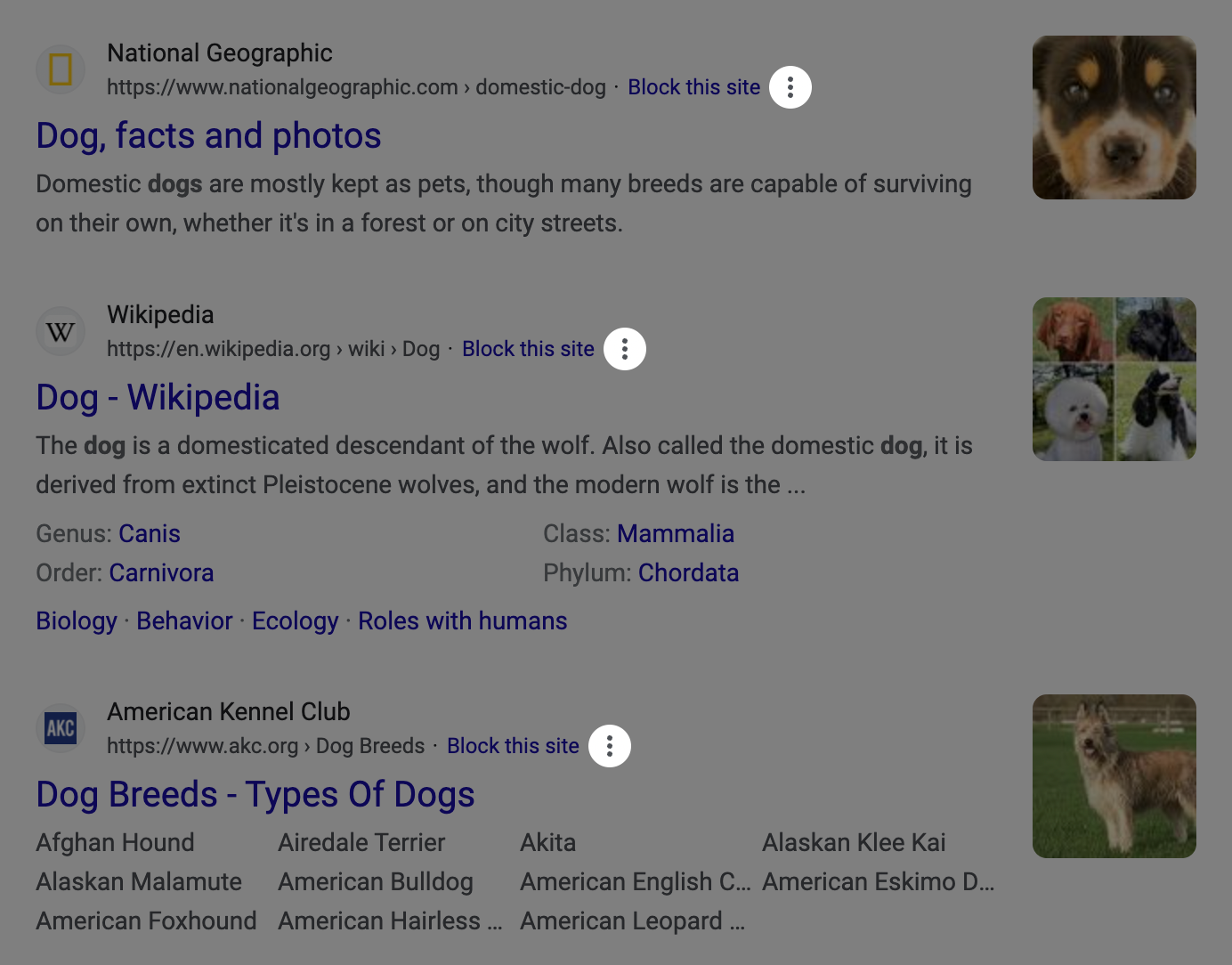
During our last session we were exploring the web, specifically a Google search result for “dogs”. This is the result we got:
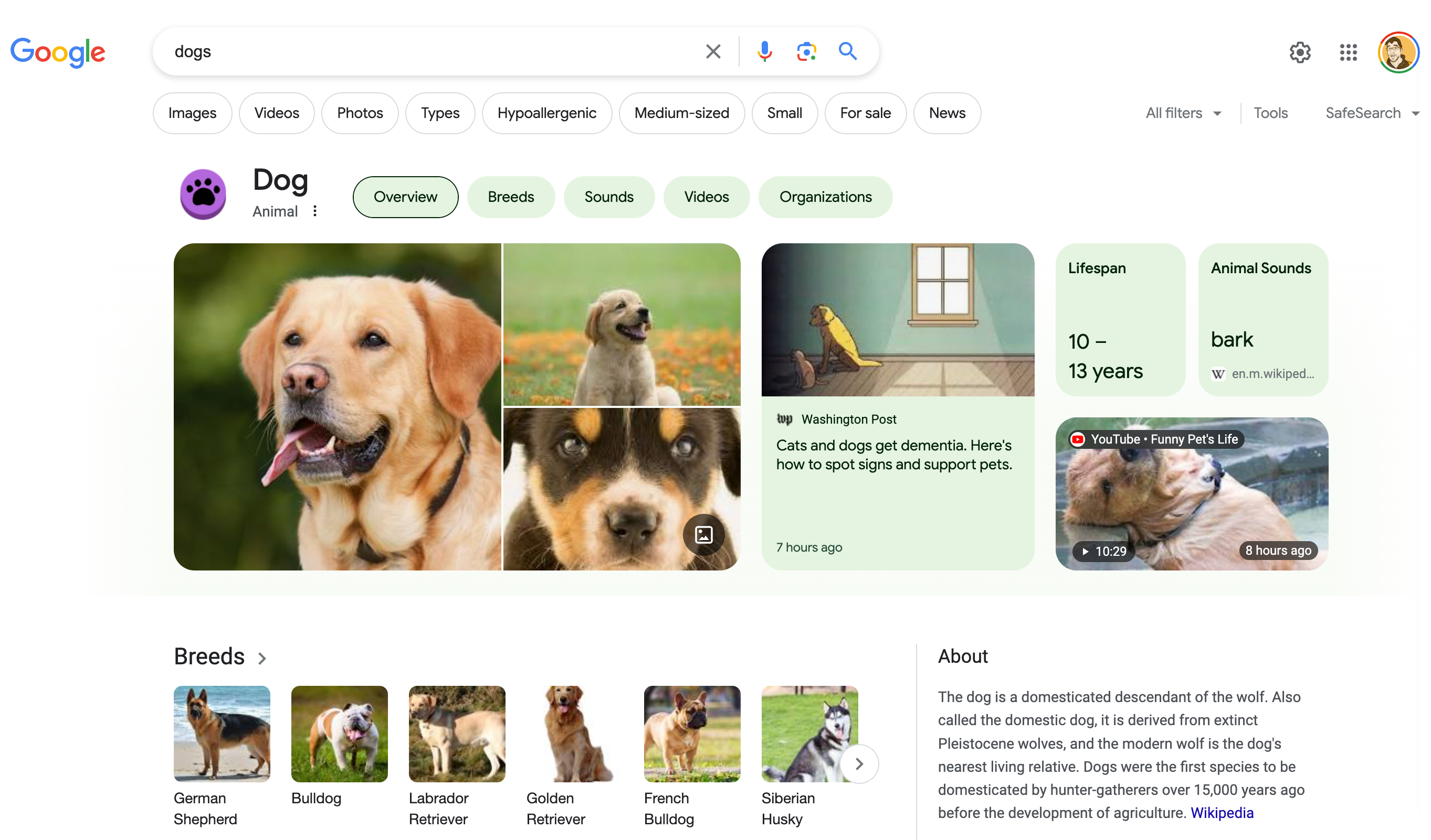
The area that occupies the main portion of the screenshot is what Google refers to as a “knowledge panel.” It’s a space before the search results that tries to answer your search query with a mix of algorithmically-generated and manually-curated information.
My instructor was telling me about some of the navigational muscle memory they had to re-learn based off of an update to the search result template’s underlying markup structure. This included adapting to the presence of knowledge panel content and its—ahem—unique decisions regarding underlying structure.
To recontextualize this in more familiar terms: a person who uses a cursor to heavily make use of an interface gets used to anticipating where and what to click. A sudden visual update forces them to re-learn where to anticipate where UI will show up.
An important takeaway here is the value of consistency and predictability—this change was not an impossible barrier to overcome. It is instead more an annoyance that requires retraining some reflexive behaviors.
Surprise and confusion
We both experienced some surprise and confusion navigating the knowledge panel. I’d like to call attention to one thing specifically here: the kebab mystery meat button.
Using NVDA, it might sound like this:
Menu button, collapsed. Submenu. More options.
Visually, it looks like this:
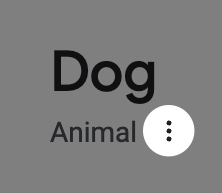
My instructor expressed confusion over what the button was for while exploring the design of the knowledge panel’s information. I, in turn, also expressed confusion with the button’s purpose based on the visual design.
Their perspective
My instructor navigated past the “Dog” heading, its the “Animal” subheading, then immediately landed on a button that announced itself as “More options”.
“More options” by itself is a pretty ambiguous term. Without the visual context of the design, my instructor was only able to rely on the context clues made available to them by the content’s order, hierarchy, and semantics.
The context clues we know in this specific situation are that:
- We’re on a search result page, after the search term itself, as well as search filter controls,
- The “more options” button is placed after the heading and subheading in the linear, top-to-bottom, left-to-right English reading order, and that
- The screen reader announces the “more options” button as a button, meaning that there is the expectation that it should consequently behave like a button if activated.
To them, these are all signals that the button might have something to do with manipulating information related to the heading and subheading content. This could, in turn, be interpreted as attempts to apply a category to the overall search.
This is a little bit strange in that if you want to modify your overall search query you typically either:
- Perform another search via the address bar or search input, or
- Navigate immediately past the search input to search filter functionality to narrow your results by image, video, photo, news, etc.
Maybe the control lets you adjust the subheading to change it from “Animal” to something else? Like maybe a subcategory like “Geographic location” or “Cartoon character?” That doesn’t seem likely.
What else could it be?
Another option to consider is what comes immediately after the button. Again, consider we may not have the visual context of the design to help steer our understanding.
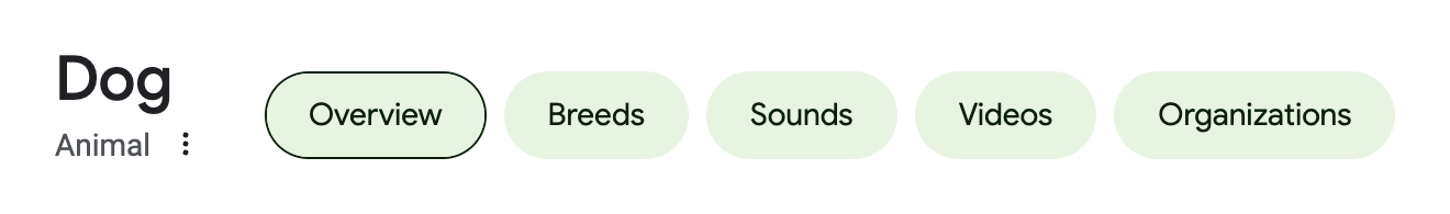
The content that comes after the “More options” button is an awkwardly-constructed tab component that navigates you to other dog-related content such as breeds, sounds, and videos. Maybe the “More options” button adjusts what the tabs show?
Visually, it looks like this:
Using NVDA, it might sound like this:
Heading level two, dog. Heading level three, animal. Menu button, collapsed. Submenu. More options. Clickable tab. Selected Overview tab. Breeds tab. Sounds tab. Videos tab. Organizations.
Note that someone who cannot see the screen will not have the benefit of seeing the context-providing visual gap between the heading and subheading and the tab component.
Adjusting the tabs also doesn’t seem likely. A “More options”-style control usually comes after the tabs, and not before. This is because it allows someone exploring the content in a linear fashion to get a better sense of what they’re dealing with before committing to manipulating it.
My perspective
While I can see how the button shows up in terms of visual proximity to the rest of the design, I can’t see the button’s accessible name of “More options”. To do that I need to either:
- Navigate to it with a screen reader, or
- Inspect it in my browser’s Developer Tools.
The button’s kebab icon (three vertical stacked dots) doesn’t clue me into specifically what function it performs.
I’m technologically literate enough to know that it will likely contain some form of overflow information. However, the larger context of the surrounding design the button is presented in does not provide a lot of clues as to what that overflow information will be or how it will manipulate things.
Equivalency
Equivalent experiences are all about ensuring everyone can use something you’ve made with the same relative degree of effort. Here, “use” is shorthand that translates to proactively accommodating all the various interaction methods and circumstantial conditions someone may have when using technology.
For example, someone with good eyesight and fine motor control using a laptop can quickly visually scan through, and then click on a link in a large list of links. Someone who cannot see the screen and is using a smartphone would likely expect an equivalent way of quickly scanning through this list to take action on something.
Typically we speak about equivalent experiences as a way of communicating why accessibility is important. However, this “More options” button unintentionally proves another, more subtle point the phrase implies: poor design can confuse everyone.
Confusion shared equally
Visually, the kebab icon does look like a button, but that’s only because I’m digitally literate. There aren’t many visual affordances that this is interactive past those three vertical dots (background color, border, hover/focus styles, etc.).
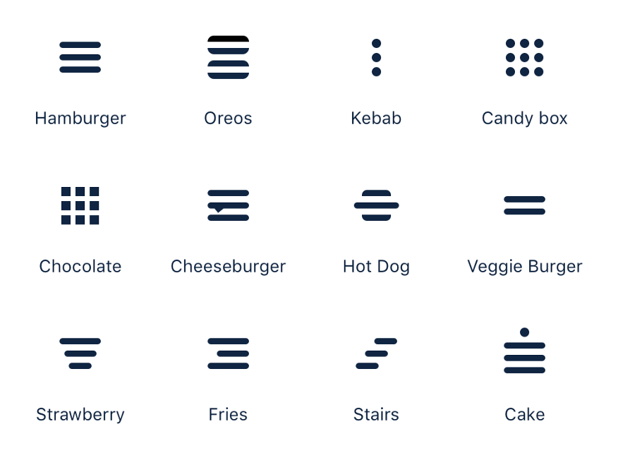
The term “kebab menu” is one of those things that is equal parts design jargon and joke. Consider the following image, and your assumptions around:
- What icons typically perform what specific functions, and
- How much industry experience it takes to be able to point out which icons in the collection are a joke, which are not, and which could realistically be both.
As touched on earlier, the auditory experience is just as vague, due to the button’s non-descriptive accessible name. Digital literacy only takes you so far here, as well.
Uncertainty and fear
I am logged into Google while viewing this search result. Will pressing the kebab button irrevocably alter my account information?
Or maybe it’s like the one time I accidentally tapped an Instagram ad. This button press cursed me with a false expression of interest being forever associated with my account.
It’s pretty unlikely that pressing the button will perform a destructive action. That said, it’s not impossible. Google is a gigantic company and can’t get it right all the time.
I honestly don’t know what will happen. My instructor also didn’t know. This is also an equivalent experience, just not a desirable one.
Accessible isn’t necessarily usable
This button is completely operable via a screen reader, keyboard, mouse cursor, and touch input. It has a visually hidden accessible name, so operating it via voice control is awkward, but not impossible.
It’s also cryptic enough that everyone might wonder what it does. To fix this:
In the short-term
We’d want to do the following sooner than later:
Clarify what the “options” part of “more options” refers to in the button’s accessible name
This will make it more clear for people who use screen readers. Clarification in this way will be especially helpful if more than one “more options” button exists in the design.
<!--
  Visually show only the icon, but still ensure a
  clear and unique accessible name for the button
-->
<button type="button">
  <svg aria-hidden="true" focusable="false">
    <!-- Icon code -->
  </svg>
  <span class="visually-hidden">
    More options: Share, claim, and send feedback about this search
  </span>
</button>
If you’re scoffing at this, know that each search result in the current design (A/B tests acknowledged) also has a kebab button with a completely different function placed after its listed URL and the option to block the site.
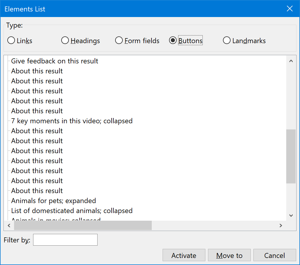
Here's what that experience might be like if you’re browsing via buttons using a feature such as NVDA’s Elements List functionality:
And here’s how the two mystery kebab buttons look when placed next to each other, devoid of the rest of the page’s content:
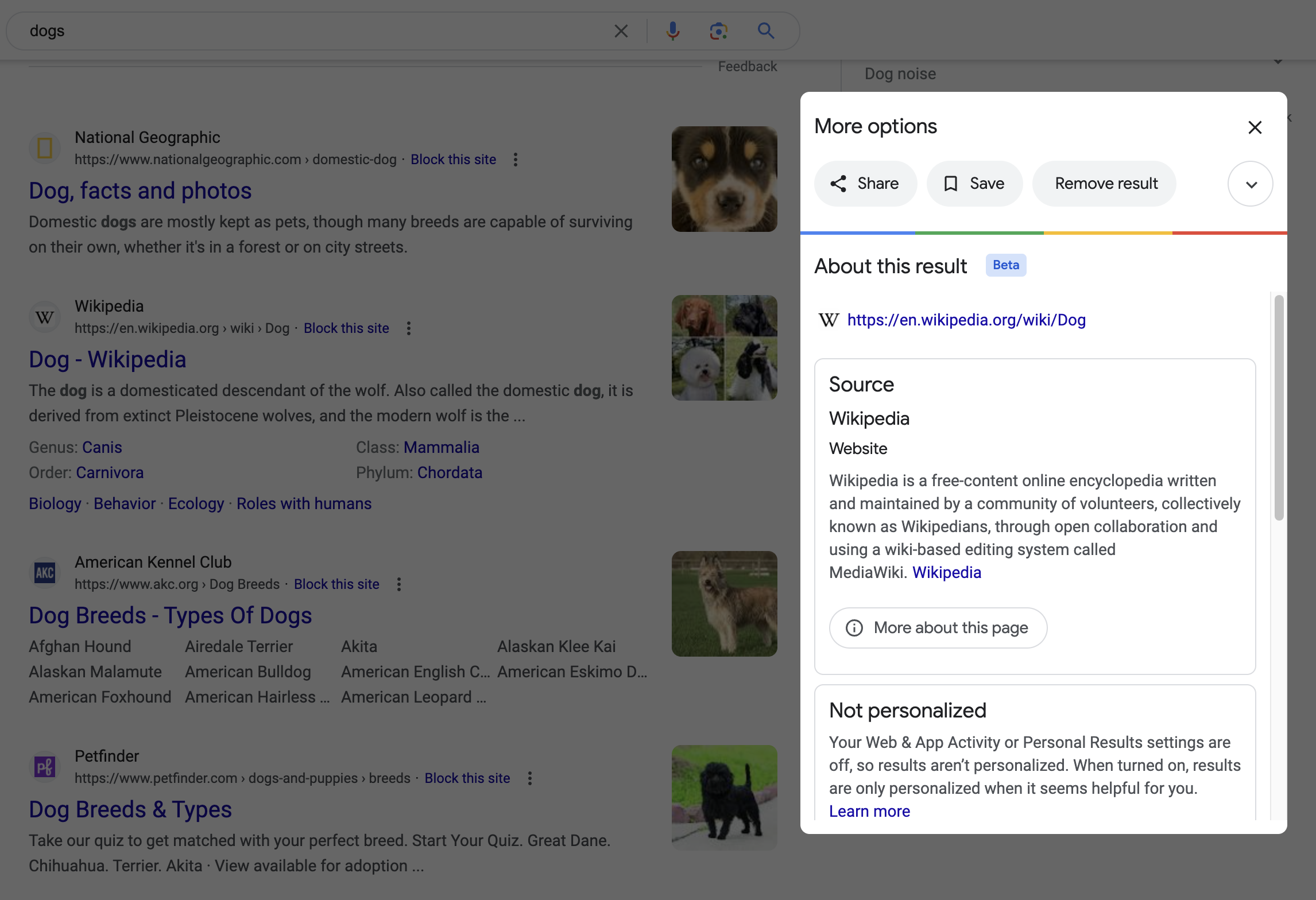
Each of these search result kebab buttons has an accessible name of “About this result”. This is different than “more options,” the other button that looks visually similar.
However, the phrasing of “about this result” is a lot like the phrasing of “more options,” in that is vague. Its phrasing also does not disambiguate which result which button speaks to.
Even more confusingly, each of these buttons also leads to a modal titled “More options”.
Visually show the button’s accessible name
So, what else can we do? We could lower ambiguity by being overwhelmingly obvious:
This will help people who can see the screen understand what the button is for, as well as communicate what they can expect to happen when they activate it. It will also help voice control users more efficiently take action on the control by showing its accessible name in full.
In the long-term
We also might want to reconsider the button’s placement in the design, as well as if the button is most appropriate piece of UI to use in the first place.
Right now the “more options” button’s existence might be checking a box for engagement requirements, but I wonder if:
- We could remove the share menu option, and then
- Integrate the claim link and report button into the knowledge panel design as discrete UI elements.
Granted, both these options might also have to contend with politics:
- Removing the tracking information included in the share link will likely affect a team’s internal perception, and also
- Adjusting knowledge panel automation to the point where its content not need to be reported by the public is a non-trivial undertaking.
Better design helps everyone
Providing better context helps everyone out, and might also translate to more meaningful engagement. I mean, who the heck is sharing a knowledge panel-generating search result for dogs to Facebook?
Starting down the path to answer that question may lead us away from the how to better build the UI, and instead move us towards questioning why we got the UI that we did.
Holistic experiences are just that
Contemporary feature creation like the knowledge panel experience this article covered are typically built piecemeal by compartmentalized teams.
This modular, assembly-line approach is usually performed in the service of driving a larger business objective. The metrics that generate the objective oftentimes exists at a level above the factory floor.
This means that the teams tasked with creating the UI that facilitates the objective are often structurally disincentivized from, or flat-out unable to question or affect change on the larger context their work is placed in. Then consider that these metrics are invisible and immaterial to the end recipient of the experience.
This applies to both the micro and the macro. A piece of UI such as a button may be inaccessible, or work with assistive technology. That UI’s placement can also make sense, or not make sense in the larger context of the overall experience.
It’s likely that there’s infrastructure in place to ensure all the engineered pieces stitch together properly. This includes our “more options” and “about this result” buttons. It’s also likely that there is also probably little-to-no infrastructure in place to question if everything stitched together makes sense as a larger whole.
Everything is tracked, but nothing is questioned.
The reason why two visually similar buttons with completely different accessible names that do two entirely unrelated things placed on such a high-traffic page only starts to makes sense when viewed through this lens.
Equivalent is good, equivalent and usable is better
The “more options” button is emblematic of how something can be technically usable by everyone, but also how its use is also confusing for all involved.
Preventing this confusion requires engaging with not only how something looks and behaves in the immediate, but also in the larger contexts it will be placed. It also requires having organizational structures that allow factoring in the holistic whole, as well as adjusting it if need be.
We can, and should strive to make experiences that are not only operable by everyone, but also intuitive.
Further reading
- Listen To Me And Not Google HeydonWorks
- I Don’t Care What Google or Apple or Whoever Did Adrian Roselli