Ever been frustrated because a movie theater plays advertisements before the trailers even start? This is a kind of experience I call “Beholden Design.”
Full of Dark Patterns and pain, Beholden Design is the evil, goatee-wearing twin of Universal Design. It forces people to interact with interfaces in order to get what they need—the other option typically being a dire consequence. This is the opposite of most experiences, where the person has a choice in whether or not to use a service.
If you look at the world through this lens you’ll begin to see a lot of it, in varying degrees of severity: tax forms (both physical and digital), healthcare-related websites and systems, DMVs, ATMs, etc.
Practitioners of Beholden Design visit suboptimal experiences on their users, either unconsciously via ignorance or negligence, or deliberately as an attempt to push a person into a choice where they create profit. In my opinion, both are inexcusable.
In this post, I’m going to talk about a Beholden Design experience that’s very much of the moment: the Equifax data breach.
Equifax
Equifax is one of the three main United States credit reporting companies. Credit reporting companies track US citizens using direct and indirect data gathering techniques to rate their credit scores. These scores are then used to measure how potentially responsible a person will be for repaying loans—loans being the only real way to make the larger purchases that let most people function in society.
Pretty messed up, right?
Ignoring for the moment that these data gathering techniques are less than perfect (and definitely prone to algorithmic bias), the entire US population is essentially auto-opted into participating in these privately-run services. This is an especially terrifying fact in the wake of the Equifax data breach of September 2017, where the personal data of 143 million unwitting people was compromised.
For a tech-savvy individual, access to about two thirds of the US population’s personally identifying information means mass credit fraud is essentially now a turnkey process.
All the information required to pretend to be someone else and take out a loan in their name has been removed from the purportedly secure Equifax servers. There is no historical precedent for the scale of this kind of event, or its ramifications.
One of the options an individual can take—either as a victim or proactively—is to request what is known as a Credit Freeze. A Credit Freeze places restrictions on who can view your credit report, effectively preventing new lines of credit from being issued. A code is then issued by the company the freeze is requested at, which can be used at a later date to reinstate credit report access.
Vexingly, the information required to request a lift on a Credit Freeze is also the information that was stolen in the breach.
While this entire system is a perfect opportunity for the application of some big-picture Service Design thinking, I’m going to focus on the experience of a person requesting a Credit Freeze.
Inwardly focused
Beholden Design is selfish. It’s systems are built to serve the service’s need, not the needs of the person who needs the service.
In requesting a Credit Freeze, an individual has to petition each service that monitors them. In addition to the big three companies (Equifax, TransUnion, and Experian), there are a few smaller ones (Innovis and ChexSystems). There might be others out there—I’m honestly not sure and frankly that’s part of the problem.
While these companies have access to your contact information, the current state of affairs dictates that a person must reach out and request a Credit Freeze to each company individually using its own freeze request service.
Placing the onus on all credit reporting companies to honor a single request issued by the user would ultimately make for a better experience for all involved. A single, centralized command could reduce potential errors across the board.
The forms themselves
The forms these companies serve up are the holy grail of bad design. Every aspect of them are user-hostile, yet are necessary for protecting oneself from harm.
Inconsistent
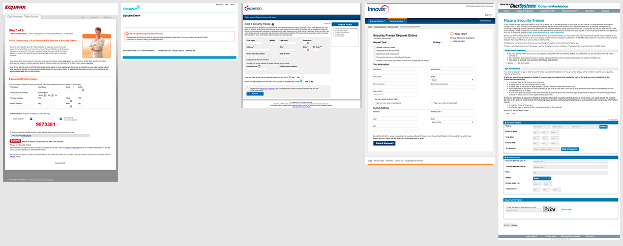
In Beholden Design, the priority is that input data satisfies the needs of internal systems, and not the end user. To that point, each Credit Freeze request form requests the same information in a slightly different manner, with different language and number of overall steps in the process.
From the perspective of person who has undertaken the effort to go through each service to request a freeze, the process appears to lack standardization. This can lead to feelings of anger, frustration, uncertainty, and suspicion in a situation where the stakes are high.
There is a very good chance this might be the first page a person encounters when visiting one of these kinds of sites. Interactions that might be standard relative to the credit monitoring website might not reflect the way the majority of forms on the rest of the internet operate.
The person visiting might not have any prior experience with this atypical navigation. The kinds of information being asked for in this process aren’t exotic. Lean on external consistency to help move a person through the process with as little friction as possible.
Verbose and vague
Another hallmark of Beholden Design is an overwhelming application of legal copy and jargon.
These forms all have too much content and not in the right place. For inward-facing priorities, satisfying the legal team is paramount, even if the resulting copy is incomprehensible to the layperson it affects.

I'm not sure why ZIP Code is trademarked, Experian.
A well-designed form can satisfy legal requirements, but also be usable. The two tricks to this are to offer the right thing at the right time, and to anticipate questions and provide just-in-time explanations.
If a form asks for an atypical or sensitive piece of information, head suspicion off at the pass and explain what it will be used for as close to the relevant input field as possible. If there is a huge preamble to undertaking the form, use progressive disclosure to break it apart and place the relevant content with the input fields it affects.
Invalid
Validation is the process of verifying that information entered into a form is both correct and formatted properly. It is a broad and deep practice within the fields of design and security, and it can go a long way to preventing events like this data breach from ever occurring.
Good form validation walks the line between being easy to use and keeping malformed/malicious input from being entered. In Beholden Design, form validation is combative and unintuitive. It is concerned with getting the text entered into its systems with as little behind-the-scenes manipulation as possible.
An example of this is requiring phone numbers to not use parenthesis for the area code, even if a person is used to writing out that information in other contexts.
While it is trivial to programmatically manipulate this information to be standardized after the user submits the form, Beholden Design is satisfied with the cheaper option: letting the user do all the work.
Beholden Design is also lazy. It will typically only expose these kinds of formatting needs only after the form is submitted, and usually in an angry blob of messaging at the top of the form. This practice violates the Gestalt Principles of proximity and continuation.
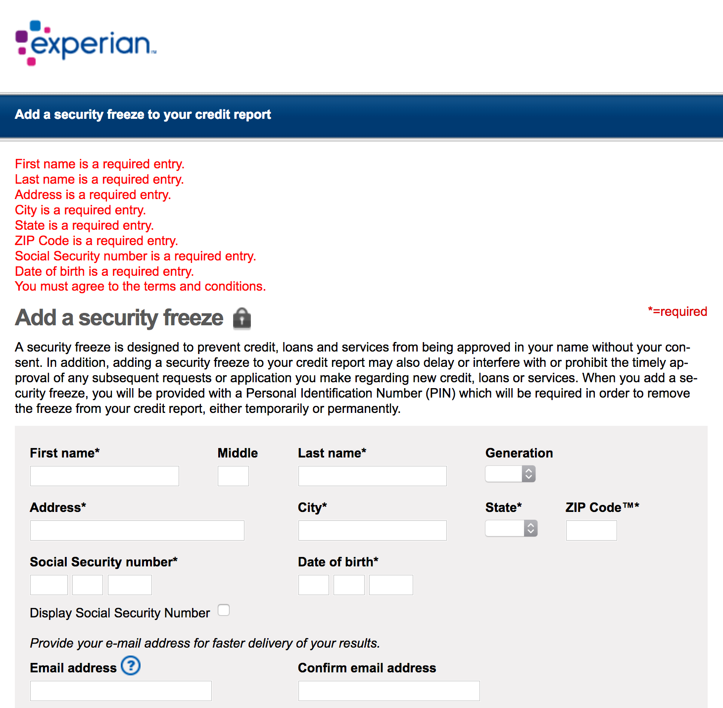
Errors are not placed next to the form fields they apply to. Form fields with errors are not highlighted. Proper formats for required information are not specified. Color does not correspond to the required input indicator (*). Validation only occurs when the entire form is submitted.
Curiously, this approach to validation tends to have the unintended consequence of encouraging bad input.
A frustrated user will attempt to fix form errors with expedience instead of accuracy—even if the information they are entering is of utmost importance. Ever slapped the side of a computer when it’s not responding to try and get it to work? It’s exactly like that.
Another interesting aspect of Beholden Design form validation is that it tends to make gross assumptions about the kind of content it will be reviewing. When you don’t accommodate for the nuance involved in the kinds of information you’re asking for, the potential to lock people out increases exponentially—especially if operating at a national scale.
Instead, accompany input with just-in-time messaging that informs the user after they move to another form field. Or better yet, place hints and examples in close proximity to the form field. A judicious application of user testing can reveal which kinds of information people will struggle with.
It goes without saying that you should go the extra mile and be able to process all the falsehood cases outlined in the link two paragraphs before this one.
Insecure and ugly
The horrid details of Equifax’s negligent security practices are being gleefully dissected elsewhere by industry professionals, so they won’t be discussed here.
However, it is important to remember that the presentation of the Credit Freeze request form in its entirety is also a consideration. Simply put, if the page does not feel legitimate, it will be treated as such. Sorry Equifax, that patronizing stock photo of a confident woman won’t count for much.
Beholden Design loves to ignore these kinds of less glamorous, yet critical pages in favor of splashy homepages that giddily announce new features. Eventually, the gap between these internally prioritized pages and the neglected ones becomes too wide, and the experience becomes incongruous.
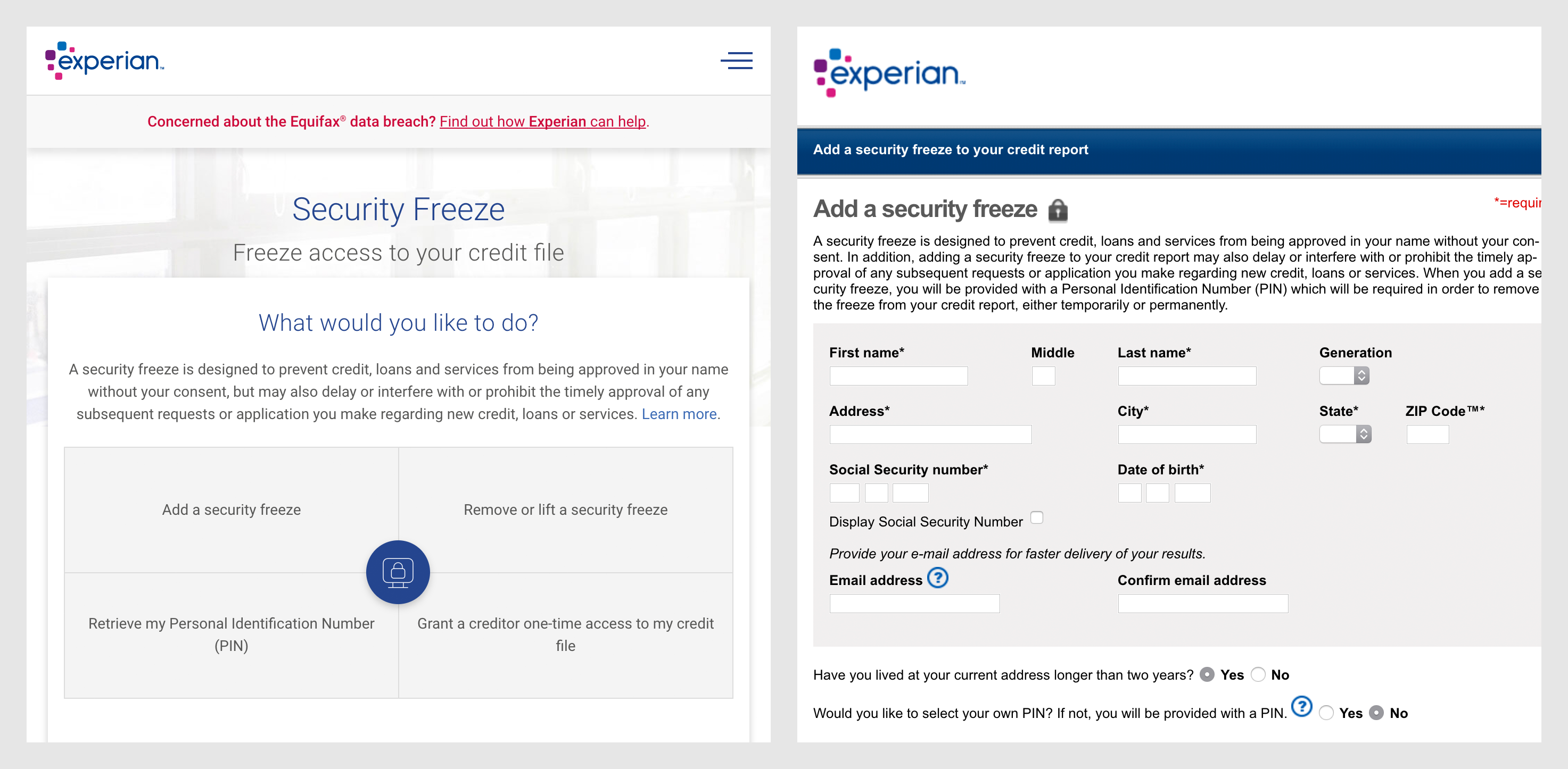
The slickly designed responsive Experian homepage compared to the clunky, fixed-width Credit Freeze request page.
Another large contributor to this split is the proliferation of third party features bolted onto the site with little consideration of how it will affect the existing experience. Larger companies are especially guilty of this—absorbing competitors and jamming their content into the site without vetting content, interaction, or quality of code and security.
Of all the issues presented in this post, this one might be the easiest to plead a case for remediating in the wake of the Equifax hack. While assurances of security and credibility are somewhat a cultural issue, it is comparatively trivial to make cosmetic updates to bring these orphaned, lower priority pages back in step with the rest of the site.
Living styleguides—catalogs of common interface and branding elements that are built from the live site's code—are a great way to ensure these kinds of visual tweaks can affect every page in the site quickly and with minimal fuss.
Components such as form inputs that have been derived from a centralized source have the benefit being able to be quickly and globally updated from upstream changes, so long as they maintain code parity.
This consistency is great for both QA and security efforts. Vetting the initial component means a good deal of edge case issues get killed off before they can ever become a problem, allowing them to be used with confidence. This frees QA testers and security auditors to efficiently focus their efforts on larger, more important tasks.
Opaque
Beholden Designed systems are indifferent. With them, the truth is irrelevant and people that use these systems are irksome afterthoughts.
The Credit Freeze process typically asks the user requesting it to verify themselves by having them select some personally identifying information contained in a few multiple choice questions. Ignoring the fact that this information is typically easy to gather from publicly available sources, these systems don’t communicate how they came to know this information, or how it’s being used. Creepy.
Furthermore, as these information gathering systems are fallible, the situation can arise where there is a difference between the system’s truth and the actual truth.
There is no obvious method to set the record straight in this situation. Instead, a user must typically make a guess as to what the system believes to be true, otherwise they cannot progress through the remainder of the Credit Freeze request process.
Not a great way to maintain trust, if you ask me.

I don't know if I'm a victim of identity theft. Or if you think I'm a victim of identity theft. That's why I'm here, Innovis.
If a person successfully goes through the process of requesting a Credit Freeze and is issued a code, typically all communication stops. While the emotional context of the person must be considered throughout this entire process, this is one of the most important moments to focus on.
For the services that mail a Credit Freeze unlock code instead of a delivering it digitally, it is radio silence until something shows up in the mail. You don’t have to be paranoid to understand how the person requesting the code being able to successfully receive it is in everyone’s best interests.
Turning a blind eye to the massive inefficiencies and potential for errors in this processes, it is baffling that the systems that require contact information they already possess don’t use it to communicate where they are in the process of addressing the request.
I guarantee you that while people may be fretting about the status of their requests, they certainly aren’t waiting at home for the code to show up.
A little communication would go a long way in this situation. A good model to build from is a package delivery service such as FedEx emailing a person about what is happening to their holiday gift order at every stage in the process until delivery.
Unresponsive
Beholden Design lives in the past.
In addition to the lack of responsiveness from the process outlined in the previous section, the majority of these forms do not respond to the size of the screen of the device the person is using to access it. Of the five services I audited, only one of them adapted to a narrow screen size. Congratulations Innovis, you’re safe this round.
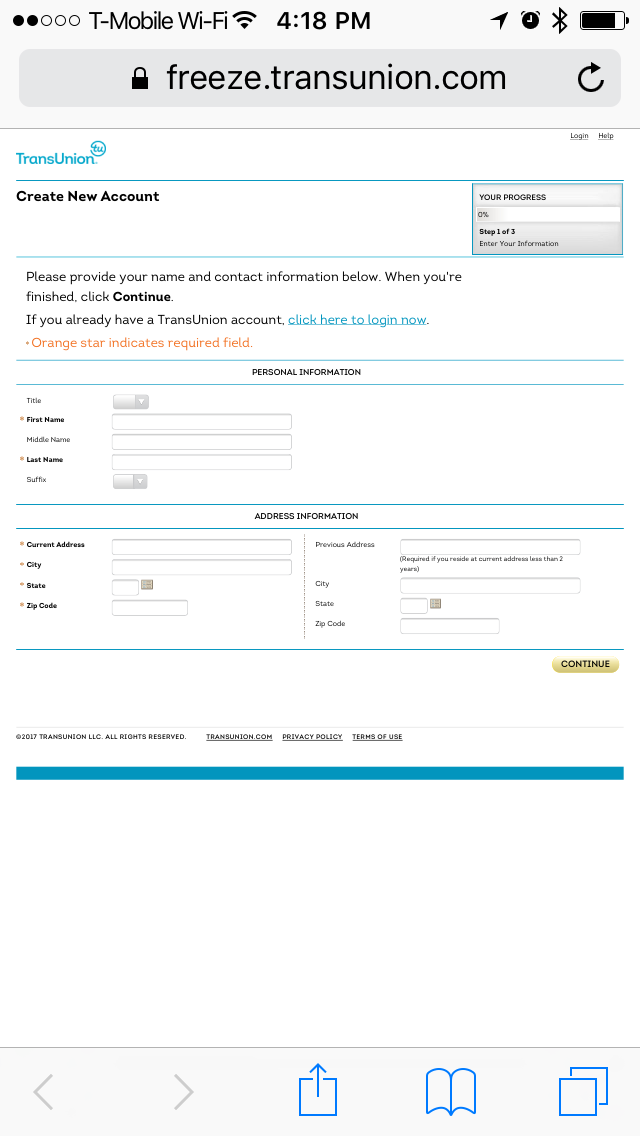
TransUnion does not get points for being Responsive. Time for some squinting and pinching.
Responsive Web Design is no longer a groundbreaking technique. It is now very much a part of the everyday web browsing experience. In the age of cheap, mass-produced web-capable devices such as phones, tablets, and e-readers, it is ridiculous to assume that a person will use a desktop computer to access information.
For many people who are economically disadvantaged, one of these devices may be their only point of entry for the web. It doesn’t take much imagination to understand the emotions of a person in this sort of situation.
While appeals to empathy and usability typically fall on deaf ears in most Beholden Design situations, there are legitimate business cases to be made for making your site responsive.
Much as how we don’t put our movies on VHS cassettes anymore, an unresponsive site is an anachronistic aberration. Google penalizes static-width sites in its search ranking algorithm, and users tend to shy away from them once encountered. If you’re in the business of data gathering, this should give you pause for concern.
In addition, a responsively designed site is easier to maintain in the long run. Working and serving the site from a single, unified codebase frees up critical development resources to be used elsewhere, say shoring up security.
Outsourced
Beholden Design loves to hire other people to do the work for them.
There’s a second wave of web design that hasn’t yet permeated organizations that practice Beholden Design. It is no longer sufficient to have a presence on the internet, nor is it safe to be the sole provider of a service. Competition is fierce, fast, and totally unsympathetic to the plights of their competitors.
Oftentimes, the forms discussed in this post are the end result of long-negotiated contracts with vendors who provide one-size-fits-all solutions to business needs. Whatever an afterthought is, these kinds of experiences typically sit far below it.
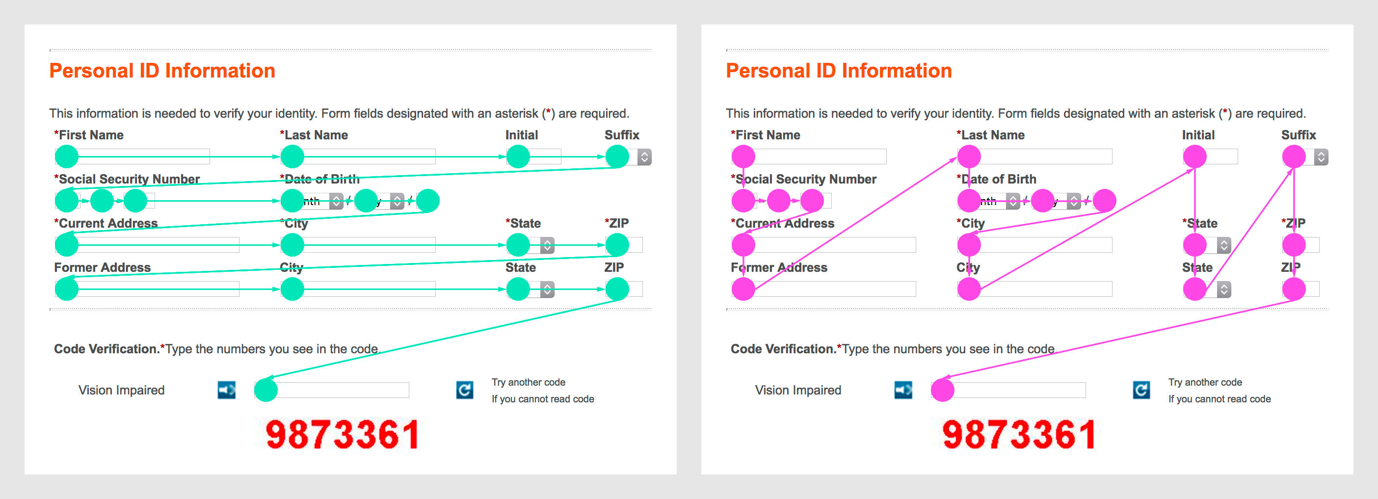
Which way am I supposed to scan this form?
Receiving quality deliverables from these kinds of vendors requires diligence on the part of the purchasing organization. Ask questions about every aspect of the contract, put the screws to vague sales claims, demand excellence in every part of the process. The lowest bidder must accommodate a request if the entire industry is demanding it.
Inaccessible
Beholden Design is unempathetic.
Each of the five sites reported accessibility errors when audited. These errors ranged in severity from a few difficult roadblocks to entirely broken systems that don’t allow people browsing with assistive technology to successfully request a Credit Freeze.
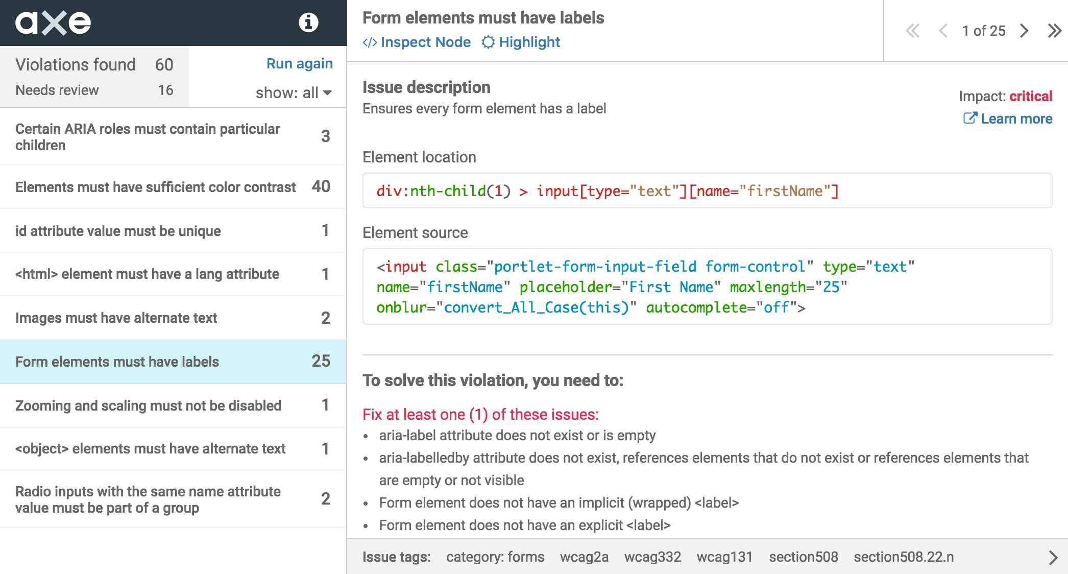
Deque's aXe accessibility audit tool reporting 60 violations on a single page of the ChexSystems Credit Freeze request process.
To say it plainly: Because of the way it is designed and coded, the current Credit Freeze request process excludes thousands of people from being able to use it.
Following the landmark Winn-Dixie case, there is now legal precedent for private individuals to successfully sue private companies for being unable to operate a website. Unlike National Federation of the Blind v. Target Corp., it no longer requires a class action lawsuit with the weight of an entire organization behind it to go to court.
For something as public and far-reaching as this data breach case, shutting people out because of the method they use to access the web is a huge liability. The less-than-stellar legal practice of binding arbitration may not prevent people from taking legal action, either.
Beholden Design also loves to ignore the truth.
Accessibility compliance is more than just accommodating blind individuals. It is also more than thinking a separate-but-equal companion site is acceptable. It is a fallacy that every individual navigating the web with a screen reader is blind. Not every person who is able-bodied will be forever—remember, we’re all just temporarily abled.
Some may argue that the alternatives—a phone support help line and a physically mailed request form—obviate the need to make these webpages compliant. However, these options are limited in their capacity to accommodate. It’s also worth noting that in the wake of the breach, both the call and mail processing centers for these institutions are going to be overloaded (to say nothing of trust issues with another poorly-paid human handling this info). Errors and neglect will inevitably follow.
It is cheaper, easier, more secure, and more convenient to let a person access the information they need in a manner that works for them. These alternative options may fall short of every possible combination of conditions someone can experience. One of the strengths of accessible digital technology is that it is interoperable, meaning that it can be modified to satisfy the needs of the person using it.
So, what’s to be done?
If you are a practitioner of Beholden Design, either unconsciously or deliberately, these are some ugly truths to face.
I think the belief that some institutions are too big to fail is about to be put to the test. There have already been calls for the corporate death penalty—to say nothing of the fact that our current economy loves to bet on small, disruptive companies upsetting the status quo.
Ultimately, this is a solid business case for empathy. I’m not talking about the feelgood checklist kind that stipulates stock photography uses a cringe-inducingly obvious cast of multicultural characters. I’m talking about the kind that bakes these kinds of considerations into the beginning of every part of the business and its processes.
This kind of change in thinking is a massive undertaking for organizations who don’t already practice it. It represents a transformation from a passive, reactive method of conducting business to an active and dynamic one that places the user first in all aspects of the experience.
To be completely honest, institutional memory and habit are difficult forces to fight (to say nothing of knowledge hoarding and fiefdoms). New marching orders will probably cost people their jobs. However, in the face of annihilation, either by competition or legal action, it is a small price for an organization to pay.
Recognize some dark part of yourself in this post? You don’t have to go it alone.
Cantina offers expertise in the kinds of disciplines needed, including organizational and service design, technical architecture, internet of things, responsive front end development and design, and product development. If you’d like to make the transition away from being a Beholden Design-led organization, make contact today.