Browsers are a failure of imagination.
I understand that new browser features and functionality need to be rolled out with care, in that you need to accommodate a wide range of technological literacy and familiarity. This is to say nothing of built-up muscle memory and the risk of change aversion.
That said, the long view of the convergent evolution that are web browsers leaves me wanting.
Functionality that would be genuinely beneficial to the people using these applications day in and day out take a backseat to things like optimizing esoteric JavaScript debugging techniques, inventing new ways to generate advertising metrics, and collapse our climate via an unrelenting torrent of AI hype.
To further explain this point of view, I’d like to talk about contrast-color(), a new CSS function.
contrast-color()
This function is part of the level 5 color module for CSS. This module contains a lot of things I’m excited for, and is part of CSS’ current Renaissance moment.
contrast-color() unlocks the ability the browser to automatically intervene for color contrast-related considerations. It “automatically provides a color with guaranteed color contrast when used as a text color on a solid background of the specified color.”
This is pretty damn cool. Given that we know:
- Minimum compliant contrast thresholds,
- Font size used, and
- At least one color value
We can instruct the browser to generate a color value for the text or the background it is placed on that is WCAG conformant.
// [1] Set a Custom Property
// [2] Use @supports for better guardrails
// [3] Use contrast-color() and a Custom Property in conjunction

:root {
  --color-secondary: #FFEDEF; // [1]
}

.my-selector {
  @supports (color: contrast-color(#FFEDEF)) { // [2]
    background-color: var(--color-secondary);
    color: contrast-color(var(--color-secondary)); // [3]
  }
}
At its core, contrast-color() is new tool that will help ensure an accessible, and therefore usable web. This is fundamentally a good thing!
If I’m understanding the syntax correctly, it can also serve as a “clamp” for color variables. The idea here is it could work with things like color-mix() to create guardrails for dynamically generated color values.
// [1] Use constrast-color() for the last color calculation
// [2] Dynamically mix --color-accent into --color-secondary

.my-selector {
  @supports (color: contrast-color(#FFEDEF)) {
    background-color: var(--color-secondary);
    color: contrast-color( // [1]
      color-mix( // [2]
        in srgb,
        var(--color-primary),
        var(--color-accent) 70%
      );
    );
  }
}
Technology does not exist in a vacuum
We also need to consider the larger contexts contrast-color() will be introduced into.
Thanks to the pervasive devaluation of both the frontend and CSS as industry concerns, awareness of, and actual use of contrast-color()’s is likely going to only be found in two general areas:
- Hobby websites for folks who like CSS and the frontend, and
- The design systems where these sorts of people tend to wind up working.
Design systems that utilize more mature concepts such as color tokens likely already have mechanisms to perform what contrast-color() does. These design systems also tend to be more accessible, either by principle or by legal compulsion. For example, Primer already has this infrastructure in place.
This also means that organizations and websites without this sort of infrastructure are far less likely to consider compliance, or possess the knowledge or resources to enact it.
We also need to consider unproductive mindsets about disability
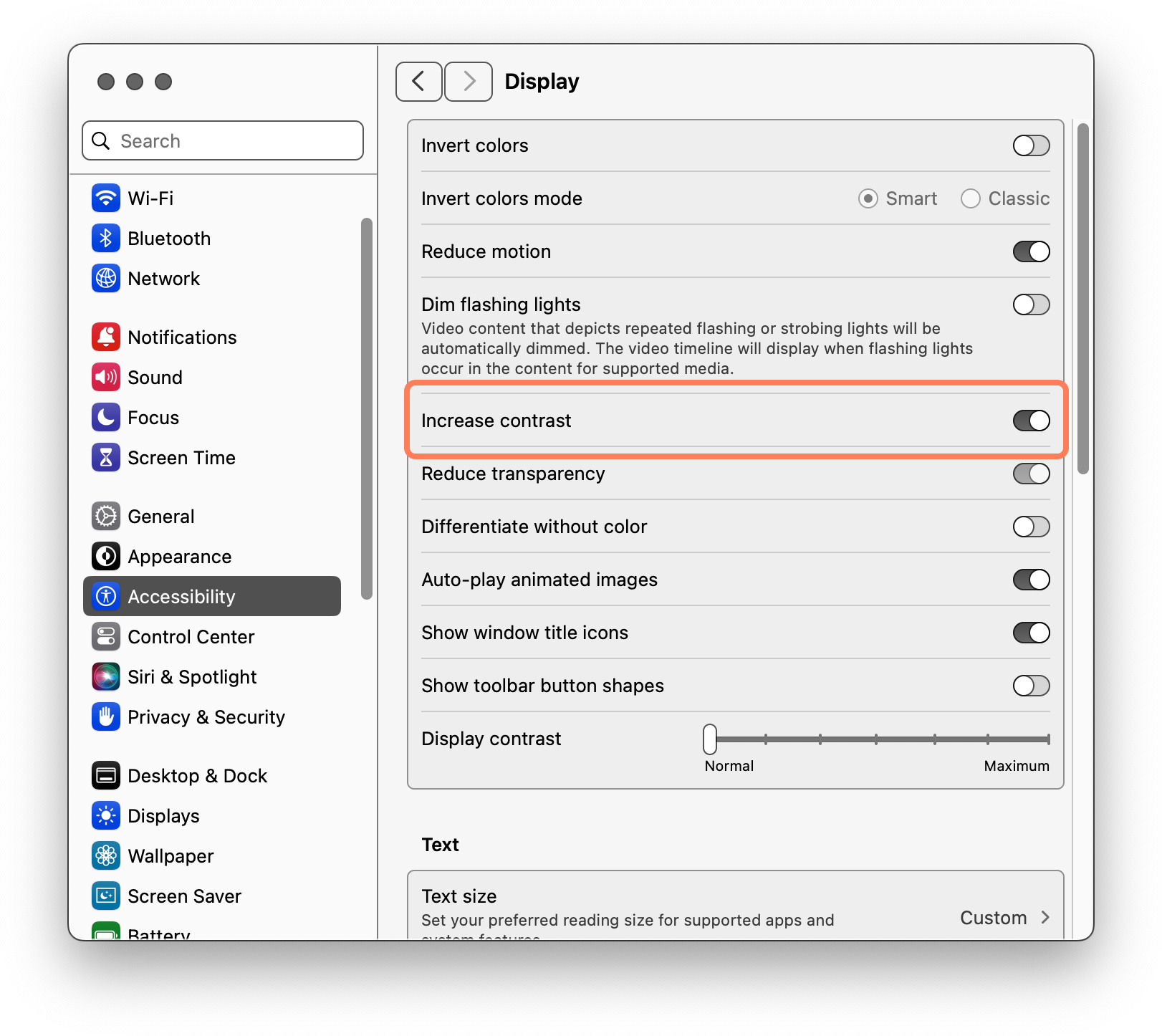
When contrast-color() is mentioned, it is usually done so along with a reference to the prefers-contrast media feature.
If you are unfamiliar with prefers-contrast, it is a way to adjust your website if an operating system preference for a higher contrast experience is enabled. Think of it like dark mode or preferring reduced motion.

The idea here is that you’d apply contrast-color() in scenarios where someone has requested a higher contrast experience, with the understanding that it’d help to ensure that experience delivers on its promise.
.my-selector {
  color: var(--color-primary);
  background-color: var(--color-secondary);

  @media (prefers-contrast: more) {
    color: contrast-color(var(--color-primary));
  }
}
Unfortunately, this thinking also sets up an ugly, “us versus them” mentality. It also presupposes that people:
- Are aware there is text content they cannot perceive,
- Are aware of having a low vision condition,
- Accept having a low vision condition, and
- Are aware of, and use the preference to do something about this.
It also assumes that the operating system has the preference toggle to enable in the first place, which isn’t always a given.
If you go down this rabbit hole—and I hope you don’t—far better to flip your thinking and start with an accessible default, and then make the alternate experiences non-compliant:
.my-selector {
  color: var(--color-primary);
  background-color: var(--color-secondary);

  @media (prefers-contrast: less) {
    color: var(--color-tertiary);
  }
}
This removes the burden of the people consuming your content needing to expend additional effort to counteract your inaccessible choices.
Further issues
Another assumption here is that people want a high contrast experience for everything, which isn’t necessarily true. For more thinking here, I suggest comparing it to Bramus Van Damme’s post, Dark Mode Toggles Should be a Browser Feature.
Furthermore, leaning on a high contrast theme to do the heavy lifting creates a scenario where the default view may be too light to be functional. This means someone may not be able to actually perceive the mechanisms needed to enable an experience that can work for them.
Experiences should be accessible by default.
Delegating accommodation to mode-based operation enables designers to continue bad practices and ableist notions about aesthetics. It’s also a ton more overhead design and code considerations to manage and maintain—better to tackle this problem on the education layer.
Targeting the right layer
Speaking of layers, I now pose the question: Why does all this have to be the website or webapp author’s responsibility?
Deep knowledge of CSS is rare, and not incentivized. Browsers already calculate, and are therefore aware of foreground and background color values. Given both of those considerations, are we missing out on a better way to go about this?
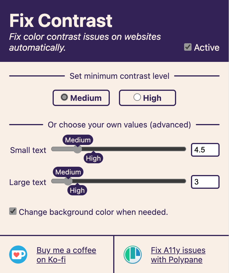
I would love to see this sort of feature implemented on the browser level. And guess what? There’s prior art that can be referenced.
FixA11y, Kilian Valkhof’s excellent browser extension. It’s a great resource, and we’re lucky to have it. And if you haven’t heard of it before? Well, it’s part of the larger point I’m driving at.

Layer seven
My question here is why isn’t this kind of functionality a stock piece of browser UI?

We can do better than that, as well. Much like with the prefers-contrast operating system preference, use of this hypothetical feature would rely on you knowing it exists in the first place.
Again, browsers are aware of most of the foreground and background colors at play, and therefore the ratio between them. What if they intervened to tell you that they could fix things for you, and then did if you requested it?
This would allow someone to become aware of the preference in a moment when it is needed. It could also be configured to be a global preference, or something tweaked on a per-site basis.
Additionally, this sort of thinking unlocks opportunities to tweak the desired contrast ratio itself on a global, site, or session-based basis.
I’m heartened to see Arc experimenting in this area, which is a hop, skip, and a jump away from integrating Midnight Lizard-style functionality. I’m also hopeful that other weird browsers might move the conversation forward here.
In the gutter, staring at the stars
I understand that making browsers takes an incredible amount of thankless effort. I also understand many people who do work on browsers may be sympathetic to my line of thinking.
I’m not mad at these individuals. I just see what is possible and wish for more.
Creating new features that help people, but don’t help extract profit are far less likely to be incentivized. At the same time, insufficient text contrast is known to be one of the most prevalent accessibility issues on the web.
This circumstance we find ourselves in is what drives my dissatisfaction. It’s my hope that in reading this you learn not only about contrast-color(), but also how to interrogate the larger environment it exists in and how it comes to be.
In the meantime, I am going to continue using baseline accessible color palettes, advocating for integrating contrast-color() where appropriate, and hoping for better.
Further reading
- Filling the potholes of the web. Frank Elavsky
- Harm Reduction Substance Abuse and Mental Health Services Administration
