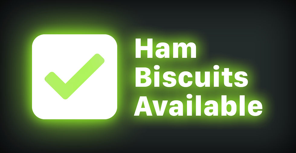
There is a tweet from a suspended Twitter user that shows a “ham biscuit sign” in its dark and lit-up state. Here’s a screenshot of it:
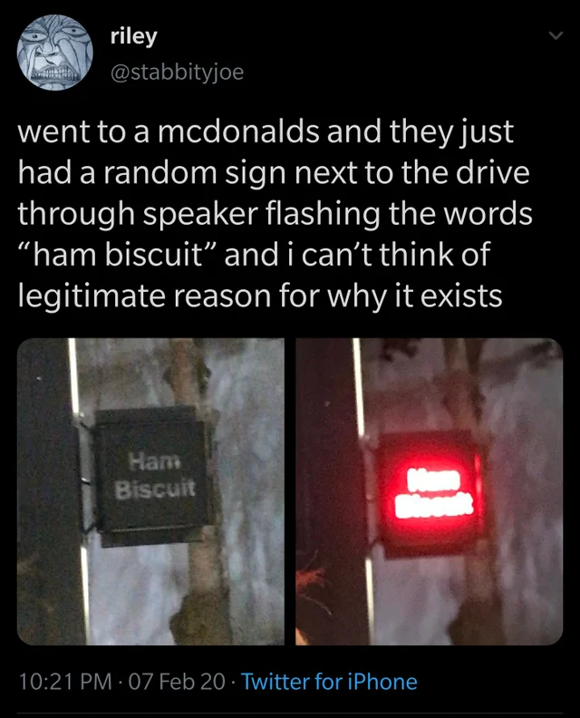
The sign is used to indicate if that particular McDonald’s had Country Ham Biscuits left in stock. Presumably, they’re a popular enough menu item that installing the sign saves both people ordering and working at at McDonald’s time and anguish.
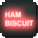
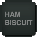
The Ham Biscuit sign is also absurd. It features as a recurring joke in one of the Slack groups I participate in, enough to warrant creating custom emoji for it:
A few days ago, one of my friends commented:
you could write a usability Medium post postulating that as easy as it is to be flummoxed by its existence, Ham Biscuit light accomplishes its goal more clearly than many modern app UIs
He’s not wrong
When the ham biscuit sign is lit up, it means ham biscuits are available. When it is not, there are no more ham biscuits left. This means that people know this kind of food is available before they enter the restaurant.
Or is he?
Red is commonly used to indicate errors in Western culture. Now I’m wondering if this means there’s a problem with ham biscuit supply, and that they’re indicating that there are none left. Maybe this is a signal to suppliers instead of consumers.
The other wrinkle is the sign blinks when it is active. Blinking adds an extra layer of consideration, in that other examples of blinking things we can reference to determine intent have multiple meanings. Think:
- Turn signals that indicate driver intent,
- Traffic lights indicating to proceed with caution,
- Hard drives indicating they’re writing data,
- LCD clocks indicating an interruption in power,
- A check engine light that indicates a misfiring engine,
- Routers indicating that data is being sent and received,
- Bluetooth devices indicating that they are ready to pair,
- A GPS device indicating it is searching for a signal,
- etc.
Big-picture, most these flashing lights means a change in normal operating mode, which further muddies the waters of what the heck is going on in ham biscuit land. “Most” is the operative word in the previous sentence, in that not every example actually does indicate a change in operating mode.
To quote another friend on the Slack:
hey, look at this sign, the ham biscuits are poppin right now
Overthinking it
Okay, okay, okay, okay. This is ridiculous. But it’s also the point.
The problem is we don’t know the initial state of the ham biscuit sign and who it is intended for. We can make assumptions, but it is guesswork to address unnecessary ambiguity. The only real way to actually know is to enter the McDonald’s and verify if our guesses are true.
The state of things
How many virtual meetings have had during quarantine where you had a panicky moment trying to figure out if you were muted or not? How many pieces of UI have you encountered where you weren’t sure if taking action would start or stop something? How many times has pushing that button irrevocably altered or destroyed something?
It’s a tough problem, and part of it is that there’s very little external consistency. Video Chat App A might indicate state one way, while Video Chat App B uses a completely different approach.
Then there’s inconsistencies in features that appear across apps of many different categories—video playback being a prime example.
The overall effects these two broad types of inconsistency creates are confusion and uncertainty. This is something we as an industry have inflicted on our users. This is all to say it’s a mess.
placeholder attribute, however.
Fixing the ham biscuit sign
There are fancy user experience/human-computer interaction terms for the problems discussed earlier, but I’d prefer to keep this post as jargon free as possible.
To fix the ham biscuit sign, we need to be more obvious:
It’s a bit of a balancing act, in that you want that sweet spot of just enough information to remove ambiguity without totally overwhelming someone.
I’m intentionally removing the blinking. The sign is either on or off, and we don’t need the extra layer of confusion. In doing so, I'm making the judgement call that people are intrinsically motivated enough to seek out ham biscuits. You don’t need the cheap gimmick of a blinking light to get their attention.
Solutioneering
Cool, wow. An unsolicited redesign, how novel.
The other part of this problem is we don’t truly know the circumstances of what led to the ham biscuit sign’s creation. This includes considerations such as:
- If our ham biscuit availability assumption is true,
- If the sign’s deployment has been successful,
- Who made the sign and what resources were made available to them,
- What the budget is,
- What hardware limitations the sign itself has,
- How permanent the sign is intended to be,
- etc.
Only by talking to people can we actually know the true scope of the issue. Doing so highlights the actual motivations, uncovers the actual problems to address, and de-risks potential solutions. Without this crucial step, anything we produce is solutioneering conjecture.
Ham biscuit sign is the floor, not the ceiling
It might be worth evaluating your websites and web apps to see where the ham biscuit signs are—moments where initial state and consequences of undertaking action are unknown.
It’s also a bit of a fool’s errand, in that we can’t fix bad examples of this in experiences we have no control over. Because of this, I’d encourage doubling down on your website or web app’s internal consistency.
In conclusion: ![]() .
.